15 Best Grafana Alternatives for 2026

Grafana Alternatives Shortlist


The best Grafana alternatives combine flexible data visualization, strong observability integrations, and scalable dashboards. As a result, these tools help teams monitor complex systems more effectively. If you’re exploring alternatives, you likely need support for diverse data sources and real-time analytics. In addition, you also need tools that integrate easily with your existing workflows. Furthermore, many platforms include features like application performance monitoring and log analysis. They also offer visualizations such as heatmaps and options to embed dashboards for wider access. Overall, these tools focus on user-friendly interfaces and a lower learning curve. Therefore, they make monitoring and troubleshooting easier while still meeting your technical and operational needs.
What Is a Grafana Alternative?
A Grafana alternative is any data visualization and observability platform that offers similar dashboarding, monitoring, and analytics capabilities as Grafana. In other words, these tools help IT teams collect, visualize, and analyze metrics, logs, and traces from various sources. Additionally, choosing a Grafana alternative lets you address specific needs such as integration preferences, scalability, or open-source requirements. At the same time, you can maintain clear visibility into your infrastructure and applications.
Best Grafana Alternatives Summary
This comparison chart summarizes pricing details for my top Grafana alternative selections to help you find the best one for your budget and business needs.
| Tool | Best For | Trial Info | Price | ||
|---|---|---|---|---|---|
| 1 | Best for real-time infrastructure monitoring | 14-day free trial + free plan + free demo available | From $4.50/node/month (billed annually) | Website | |
| 2 | Best for AI-powered observability automation | Free demo + 15-day free trial available | From $7/host/month | Website | |
| 3 | Best for multi-cloud environment monitoring | Free demo + 14-day free trial available | From $15/host/month (billed annually) | Website | |
| 4 | Best for full-stack telemetry correlation | Free trial + free demo available | Pricing upon request | Website | |
| 5 | Best for enterprise-scale data ingestion | 14-day free trial + free demo available | Pricing upon request | Website | |
| 6 | Best for Elasticsearch data visualization | 7-day free trial available | Pricing upon request | Website | |
| 7 | Best for code-driven dashboard creation | 14-day free trial + free demo available | From $0.20/million metric data points | Website | |
| 8 | Best for customizable dashboard templating | Free, open-source | Free to use | Website | |
| 9 | Best for open-source distributed tracing | 30-day free trial + free demo available | From $49/month | Website | |
| 10 | Best for Microsoft ecosystem integration | Free trial + free plan + free demo available | From $9/user/month (billed annually) | Website |
Why Trust Our Software Reviews
We’ve been testing and reviewing software since 2023. As tech leaders ourselves, we know how critical and difficult it is to make the right decision when selecting software.
We invest in deep research to help our audience make better software purchasing decisions. We’ve tested more than 2,000 tools for different tech use cases and written over 1,000 comprehensive software reviews. Learn how we stay transparent & our software review methodology.
-

Deel IT
Visit WebsiteThis is an aggregated rating for this tool including ratings from Crozdesk users and ratings from other sites.4.9 -
Freshservice
Visit WebsiteThis is an aggregated rating for this tool including ratings from Crozdesk users and ratings from other sites.4.6 -
Rippling IT
Visit WebsiteThis is an aggregated rating for this tool including ratings from Crozdesk users and ratings from other sites.4.8


Grafana Alternatives Reviews
Below are my detailed summaries of the Grafana alternatives that made it onto my shortlist. My reviews offer a detailed look at the features, integrations, and best use cases of each platform to help you find the best one for you.
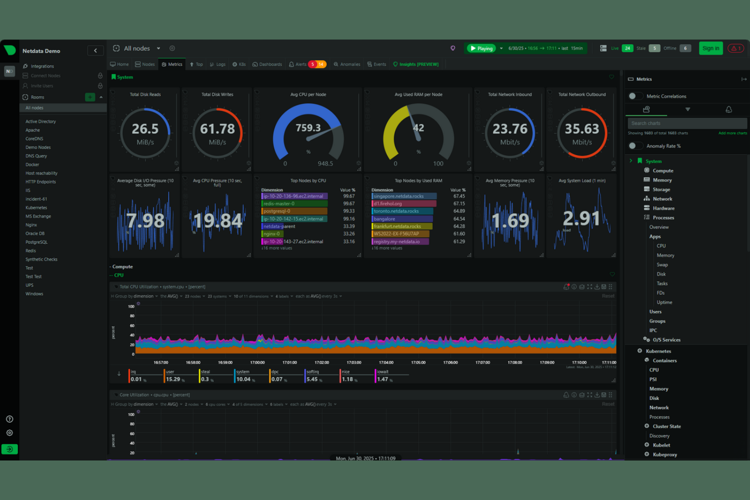
Netdata offers a specialized platform for real-time infrastructure monitoring and troubleshooting. It’s designed for IT teams and system administrators who need instant visibility into the health and performance of their servers, containers, and applications. Unlike many other observability tools, Netdata emphasizes high-frequency data collection and granular, per-second metrics for rapid issue detection.
Who Is Netdata Best For?
Netdata is a strong choice for IT operations teams and system administrators in organizations that require real-time, high-resolution monitoring of infrastructure across distributed environments.
Why Netdata Is a Good Grafana Alternative
Netdata stands out for teams that need real-time infrastructure monitoring with second-by-second data granularity. I picked Netdata because it collects and visualizes high-frequency metrics across servers, containers, and applications without noticeable delay. Its auto-detection of hundreds of metrics and instant anomaly detection features make it especially useful for troubleshooting live issues. For anyone who needs immediate, detailed insights into infrastructure health, Netdata offers a level of real-time visibility that many other platforms—including Grafana—don’t match out of the box.
Netdata Key Features
Some other features in Netdata that are valuable for observability and visualization include:
- Pre-built dashboards: Netdata provides ready-to-use dashboards for common infrastructure components, making it easy to start monitoring without manual setup.
- Health monitoring and alerting: The platform includes built-in health checks and customizable alerting rules for proactive issue detection.
- Distributed data collection: Netdata supports monitoring across multiple nodes and locations, aggregating data for a unified view.
- Extensive plugin support: Users can extend monitoring capabilities with plugins for databases, web servers, and other popular technologies.
Netdata Integrations
Integrations include Kubernetes, AWS, GCP GCE, Blackbox, Docker, VMware, Proxmox, Red Hat, Windows, Hetzner, and more.
Pros and Cons
Pros:
- Built-in health checks and alerting
- Lightweight agent with minimal resource usage
- Real-time, per-second infrastructure monitoring
Cons:
- No built-in support for custom dashboards
- Limited historical data retention options
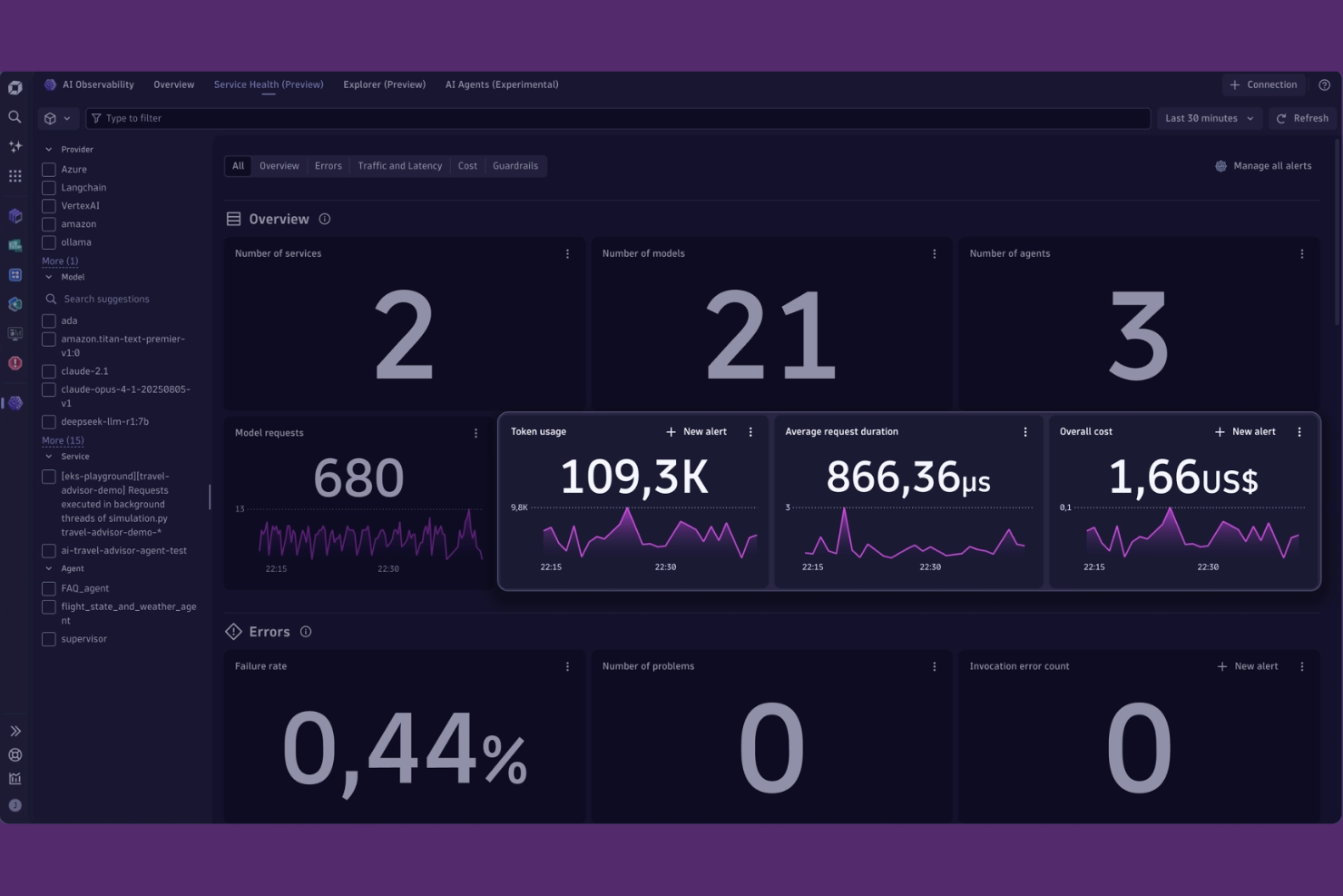
Dynatrace is a full-stack observability platform designed for organizations managing complex, dynamic environments. It appeals to IT teams and site reliability engineers who need automated insights and root cause analysis across cloud-native and hybrid systems. If you’re looking for a solution that goes beyond dashboards to deliver context-rich, AI-driven observability, Dynatrace is worth considering.
Who Is Dynatrace Best For?
Dynatrace is a strong fit for enterprise IT teams and site reliability engineers managing large-scale, cloud-native, or hybrid environments.
Why Dynatrace Is a Good Grafana Alternative
When I look for observability platforms that go beyond visualization, Dynatrace stands out for its AI-powered automation. Its Davis AI engine continuously analyzes telemetry data, automatically detecting anomalies and pinpointing root causes without manual intervention. This level of automation helps teams reduce alert fatigue and accelerate incident response, especially in complex, distributed environments. For organizations that want more than just dashboards and need proactive, automated insights, Dynatrace offers a compelling alternative to Grafana.
Dynatrace Key Features
Some other features that make Dynatrace a strong choice for observability and visualization include:
- Full-stack topology mapping: Visualizes dependencies across infrastructure, applications, and services in real time.
- Distributed tracing: Tracks requests end-to-end across microservices and hybrid environments.
- Custom dashboard builder: Lets you create tailored dashboards with a wide range of visualization widgets.
- Log analytics: Centralizes log data and enables advanced querying and correlation with metrics and traces.
Dynatrace Integrations
Integrations include AWS, Google Cloud, Kubernetes, Slack, Jira, PagerDuty, GitHub, JetBrains, Cursor IDE, and more.
Pros and Cons
Pros:
- Unified monitoring for infrastructure, apps, and logs
- Built-in distributed tracing for microservices
- AI-driven root cause analysis for incidents
Cons:
- Requires agent installation on monitored hosts
- Custom dashboard widgets are more limited
Datadog is a cloud-based observability platform built for organizations managing complex, distributed systems. It’s especially useful for IT teams and DevOps professionals who need unified monitoring across infrastructure, applications, and services. If you’re looking for deep visibility into multi-layered environments and want to correlate metrics, traces, and logs in one place, Datadog offers a tightly integrated solution.
Who Is Datadog Best For?
Datadog is a strong choice for IT operations and DevOps teams in mid-sized to large enterprises that need unified monitoring across multi-cloud and hybrid environments.
Why Datadog Is a Good Grafana Alternative
For teams monitoring multi-cloud environments, Datadog offers unified visibility across AWS, Azure, Google Cloud, and on-premises systems in a single platform. I picked Datadog because it automatically correlates metrics, traces, and logs from diverse sources, making it easier to troubleshoot issues that span multiple cloud providers. Its out-of-the-box integrations and service maps help you visualize dependencies and performance across distributed architectures. This makes Datadog a strong alternative to Grafana for organizations that need deep, cross-cloud observability without stitching together multiple tools.
Datadog Key Features
Some other features that set Datadog apart for data visualization and observability include:
- Custom dashboards: Build tailored visualizations using drag-and-drop widgets and a wide range of chart types.
- Synthetics monitoring: Simulate user interactions and monitor API endpoints to proactively detect issues.
- Anomaly detection: Automatically identify unusual patterns in metrics using machine learning algorithms.
- Role-based access control: Manage user permissions and restrict access to sensitive data and dashboards.
Datadog Integrations
Integrations include AWS, Google Cloud, Kubernetes, Docker, Slack, PagerDuty, Jenkins, GitHub, MongoDB, and more.
Pros and Cons
Pros:
- Provides real-time alerting with customizable thresholds
- Offers built-in log management and analytics
- Supports unified monitoring across multiple cloud providers
Cons:
- Some advanced features require separate billing
- Limited support for on-premises-only environments
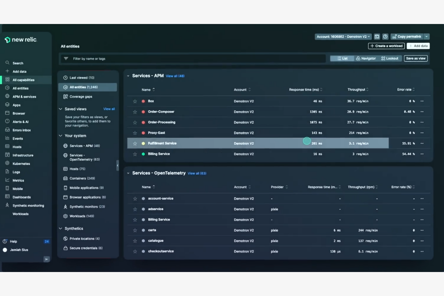
If you’re looking for a unified observability platform that brings together metrics, traces, and logs, New Relic is worth a close look. It’s designed for IT teams, DevOps engineers, and SREs who need deep visibility across modern application stacks. New Relic helps you quickly pinpoint issues and understand system health in complex, distributed environments.
Who Is New Relic Best For?
New Relic is a strong choice for DevOps teams and IT organizations in midsize to large enterprises managing complex, distributed systems.
Why New Relic Is a Good Grafana Alternative
What sets New Relic apart as a Grafana alternative is its ability to correlate full-stack telemetry—metrics, traces, and logs—in a single platform. I picked New Relic for teams that need to quickly connect the dots between infrastructure, application, and user experience data without switching tools. Its unified query language and curated visualizations make it easier to investigate incidents and understand system behavior across distributed environments. This approach helps IT and DevOps teams move beyond dashboarding to true end-to-end observability.
New Relic Key Features
Some other features that make New Relic a strong option for observability and visualization include:
- Synthetic monitoring: Simulates user interactions to proactively test application and API performance.
- Customizable alert policies: Lets you define specific thresholds and conditions for alerting across your stack.
- Mobile and browser monitoring: Tracks real user experiences on web and mobile applications in real time.
- Infrastructure monitoring: Provides detailed visibility into servers, containers, and cloud resources.
New Relic Integrations
Integrations include AWS, Azure, Google Cloud Platform, Kubernetes, Prometheus, Kafka, MySQL, NGINX, WordPress, and Docker.
Pros and Cons
Pros:
- Automated anomaly detection with AI insights
- Built-in distributed tracing for microservices
- Correlates metrics, traces, and logs natively
Cons:
- Requires agent installation on all hosts
- Custom dashboard widgets are more limited

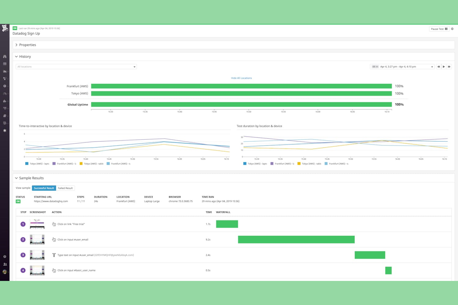
Splunk is a data platform designed for organizations that need to collect, search, and analyze massive volumes of machine data. It’s especially appealing to IT, security, and operations teams in large enterprises that require real-time visibility across complex environments. If you’re looking for a solution that can handle diverse data sources and deliver actionable insights at scale, Splunk is worth considering.
Who Is Splunk Best For?
Splunk is a good fit for large enterprises and IT teams that need to ingest, monitor, and analyze high volumes of machine data across diverse systems.
Why Splunk Is a Good Grafana Alternative
When you need to handle enterprise-scale data ingestion, Splunk offers capabilities that go beyond what most visualization tools provide. I picked Splunk for its ability to collect, index, and search massive volumes of machine data from virtually any source in real time. Its event correlation and advanced search features help IT and security teams quickly identify patterns and anomalies across complex environments. For organizations that need to centralize observability and make sense of high-velocity data streams, Splunk stands out as a strong alternative to Grafana.
Splunk Key Features
Some other features that set Splunk apart for observability and visualization include:
- Customizable dashboards: Build interactive dashboards with a wide range of visualization options tailored to your data.
- Alerting and notifications: Set up real-time alerts and notifications based on specific search criteria or thresholds.
- Data model acceleration: Speed up reporting and analytics by creating accelerated data models for frequently queried datasets.
- Role-based access control: Manage user permissions and data access with granular, role-based controls.
Splunk Integrations
Integrations include AWS, Microsoft Windows, Google Cloud Platform, Microsoft Cloud Services, Unix and Linux, Okta Identity Cloud, ServiceNow, and more.
Pros and Cons
Pros:
- Advanced alert management and tracking
- Handles massive data volumes at scale
- Best-in-class log management and analysis
Cons:
- Outdated user interface compared to peers
- Slower search speeds for vast datasets
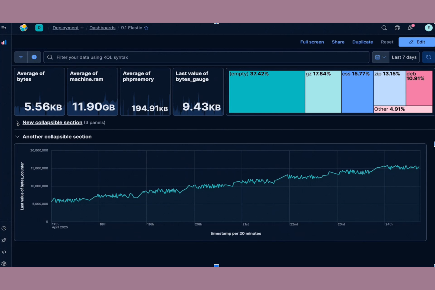
Kibana is a visualization and analytics platform built specifically for data stored in Elasticsearch. It’s a strong choice for teams that need to explore, analyze, and present large volumes of log or event data in real time. If your organization relies on the Elastic Stack for search or observability, Kibana helps you turn raw data into actionable insights.
Who Is Kibana Best For?
Kibana is a good fit for IT and DevOps teams in organizations that use Elasticsearch to manage and analyze large-scale log, event, or operational data.
Why Kibana Is a Good Grafana Alternative
Kibana stands out as a Grafana alternative because it’s purpose-built for visualizing and analyzing data stored in Elasticsearch. I picked Kibana for teams that need deep, native integration with the Elastic Stack, especially when working with large-scale log and event data. Its features, like real-time interactive dashboards and advanced search capabilities, let you drill into Elasticsearch data without extra configuration. If your observability workflows depend on Elasticsearch, Kibana offers visualization tools that are tightly aligned with your data sources.
Kibana Key Features
Some other features in Kibana that are valuable for data visualization and observability include:
- Canvas Workpad: Create pixel-perfect, infographic-style visualizations using live Elasticsearch data.
- Machine Learning Integration: Detect anomalies and forecast trends directly within your dashboards.
- Role-Based Access Control: Manage user permissions and data access at a granular level.
- Reporting and Sharing Tools: Export dashboards and visualizations as PDFs or share them with stakeholders securely.
Kibana Integrations
Integrations include Elasticsearch, Logstash, Beats, Amazon Web Services, Microsoft Azure, Google Cloud, Slack, PagerDuty, ServiceNow, GitHub, and more.
Pros and Cons
Pros:
- Canvas workpad for custom infographic dashboards
- Built-in machine learning for anomaly detection
- Real-time querying and visualization of log data
Cons:
- Alerting features require additional configuration
- Limited support for non-Elasticsearch data sources
Dash0 is a modern observability platform designed for teams who want to build dashboards programmatically. It’s especially appealing to developers and data engineers who prefer code-driven workflows over point-and-click interfaces. If you need granular control over dashboard creation and want to automate visualization as part of your deployment process, Dash0 offers a unique approach compared to traditional tools.
Who Is Dash0 Best For?
Dash0 is a strong fit for developer teams and data engineers in tech-driven organizations that want to automate dashboard creation through code.
Why Dash0 Is a Good Grafana Alternative
What sets Dash0 apart from Grafana and other alternatives is its code-driven approach to dashboard creation. I picked Dash0 for teams that want to define, version, and deploy dashboards as code, making it easier to integrate visualization into CI/CD pipelines. The platform supports YAML-based dashboard definitions and offers a CLI for managing dashboards programmatically. This approach gives developers more control and flexibility, especially when automating observability workflows at scale.
Dash0 Key Features
Some other features that make Dash0 stand out for data visualization and observability include:
- Live data preview: See real-time updates to your dashboards as you edit code, helping you validate changes instantly.
- Role-based access control: Manage user permissions and restrict access to sensitive dashboards or data sources.
- Support for multiple data sources: Connect to a variety of databases and cloud services, including PostgreSQL, MySQL, and AWS services.
- Custom widget development: Build and reuse your own visualization components using Dash0’s extensible widget framework.
Dash0 Integrations
Integrations include AWS, Google Cloud Platform, Prometheus, OpenTelemetry, Kubernetes, PostgreSQL, MySQL, RabbitMQ, Slack, and more.
Pros and Cons
Pros:
- Allows custom widget development in JavaScript
- Supports real-time data preview during edits
- Enables dashboard versioning with code repositories
Cons:
- Limited community-contributed plugins and widgets
- No built-in drag-and-drop dashboard editor

Perses is an open-source observability platform built for teams that want full control over their dashboarding experience. It’s a strong fit for organizations that need flexible, vendor-neutral visualization tools without the complexity of legacy solutions. If you’re looking for a modern alternative to Grafana that emphasizes simplicity and extensibility, Perses is worth considering.
Who Is Perses Best For?
Perses is a good fit for DevOps teams and platform engineers in organizations that need highly customizable, open-source dashboard solutions for observability.
Why Perses Is a Good Grafana Alternative
What sets Perses apart from other Grafana alternatives is its focus on customizable dashboard templating. I picked Perses because it lets you define and reuse dashboard templates as code, making it easy to standardize visualizations across teams and environments. The platform’s open-source approach means you can adapt dashboard structures to fit unique monitoring needs without being locked into a specific vendor’s format. For teams that want to automate dashboard creation and maintain consistency at scale, Perses offers a flexible and modern solution.
Perses Key Features
In addition to its dashboard templating capabilities, Perses offers several other features that support observability and visualization needs:
- Prometheus Data Source Support: Perses natively connects to Prometheus, allowing you to visualize metrics directly from your existing monitoring stack.
- JSON-Based Configuration: All dashboards and panels are defined in JSON, making them easy to version control and automate.
- Panel Plugin Architecture: The platform supports extensible panel types, so you can add new visualization options as your needs evolve.
- Role-Based Access Control: Built-in RBAC lets you manage user permissions and restrict access to sensitive dashboards.
Perses Integrations
Integrations include Prometheus, Loki, Tempo, Pyroscope, and more.
Pros and Cons
Pros:
- JSON-based configuration enables version control
- Lightweight deployment with minimal dependencies
- Native support for Prometheus and time-series data
Cons:
- No built-in support for SQL data sources
- Smaller plugin ecosystem compared to Grafana
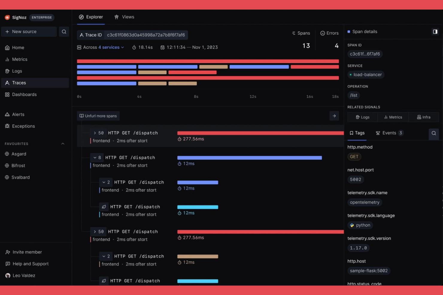
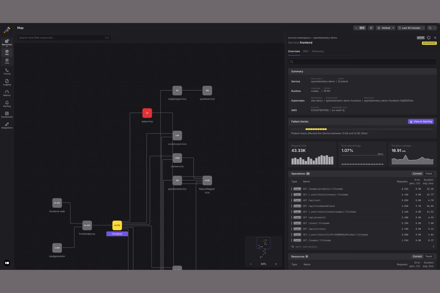
If you’re looking for an open-source observability platform built for modern distributed systems, SigNoz is worth a close look. It’s designed for engineering teams who need to monitor, visualize, and troubleshoot application performance across microservices and cloud-native environments. SigNoz helps you pinpoint bottlenecks and trace issues across complex architectures, making it a strong fit for organizations running large-scale, distributed applications.
Who Is SigNoz Best For?
SigNoz is a good fit for engineering teams in tech-driven companies that need open-source observability and distributed tracing across microservices and cloud-native environments.
Why SigNoz Is a Good Grafana Alternative
What makes SigNoz stand out as a Grafana alternative is its deep focus on open-source distributed tracing. I picked SigNoz for teams that need to visualize and analyze traces across microservices, which is something Grafana doesn’t natively provide out of the box. SigNoz offers built-in support for OpenTelemetry, letting you capture, store, and query trace data alongside metrics and logs. This unified approach to observability helps you quickly pinpoint performance issues in complex, distributed environments.
SigNoz Key Features
In addition to its distributed tracing capabilities, SigNoz offers several other features that support observability and visualization needs:
- Custom Dashboards: Build and customize dashboards to visualize metrics and logs from multiple sources in one place.
- Alerting Engine: Set up alerts based on metric thresholds or anomalies to proactively monitor system health.
- Service Map Visualization: Visualize service dependencies and interactions to better understand application architecture.
- Role-Based Access Control: Manage user permissions and data access with granular security controls for teams.
SigNoz Integrations
Integrations include Redis, PostgreSQL, MongoDB, Clickhouse, Microsoft SQL Server, Nginx, AWS EC2, AWS Lambda, AWS RDS, Temporal, and more.
Pros and Cons
Pros:
- Active community with frequent feature updates
- Flexible deployment for self-hosted or cloud
- Integrated metrics, traces, and logs in one UI
Cons:
- Requires more manual dashboard setup
- Alerting features are less mature
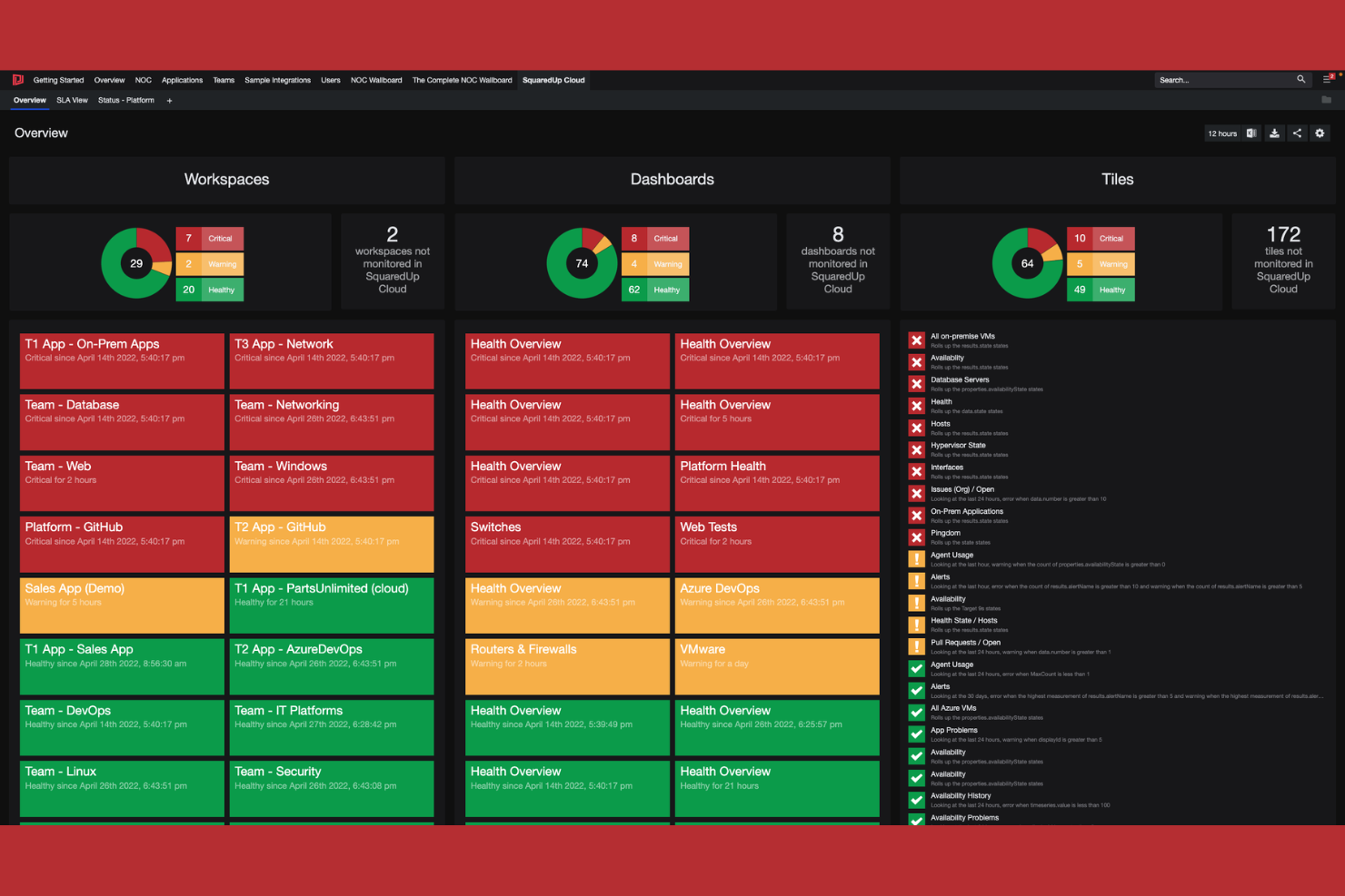
SquaredUp offers a focused approach to data visualization and observability for organizations invested in Microsoft technologies. It’s a strong fit for IT teams managing Azure, Microsoft 365, or hybrid cloud environments who need unified dashboards and actionable insights. If you’re looking to simplify monitoring across Microsoft-centric infrastructure, SquaredUp addresses visibility gaps that many other platforms overlook.
Who Is SquaredUp Best For?
SquaredUp is a good fit for IT operations teams in midsize to large enterprises that rely heavily on Microsoft Azure and Microsoft 365.
Why SquaredUp Is a Good Grafana Alternative
What makes SquaredUp stand out as a Grafana alternative is its deep, native integration with the Microsoft ecosystem. I picked SquaredUp for teams that need to visualize and monitor Azure, Microsoft 365, and hybrid cloud resources without complex configuration or third-party connectors. Its prebuilt dashboards and direct data connections to Microsoft services help IT teams surface insights that are often hard to access in other platforms. This focus on Microsoft-centric environments makes SquaredUp especially valuable for organizations standardizing on Microsoft technologies.
SquaredUp Key Features
Some other features I found valuable for data visualization and observability include:
- Open Access Dashboards: Share dashboards securely with anyone in your organization, even if they don’t have a SquaredUp account.
- Native ServiceNow Integration: Connect directly to ServiceNow to visualize incident and change data alongside infrastructure metrics.
- PowerShell Data Sources: Pull in custom data from PowerShell scripts for flexible, tailored visualizations.
- Drilldown Navigation: Click through dashboard elements to access detailed, contextual views of underlying data.
SquaredUp Integrations
Integrations include SCOM, AWS, ServiceNow, Splunk, Elasticsearch, Azure DevOps, VMware, Prometheus, Office 365, SAP, and Zendesk.
Pros and Cons
Pros:
- Supports custom data via PowerShell scripts
- Secure dashboard sharing without user accounts
- Prebuilt dashboards for Microsoft environments
Cons:
- Fewer community-created dashboard templates
- No built-in support for on-premises Linux monitoring
Other Grafana Alternatives
Here are some additional Grafana alternatives that didn’t make it onto my shortlist, but are still worth checking out:
- OpenSearch
With integrated search and analytics engine
- OpenObserve
For high-ingest log analytics
- Honeycomb
For high-cardinality event analysis
- Better Stack
For collaborative incident management workflows
- Chronosphere
For cloud-native scale and reliability


Grafana Alternatives Selection Criteria
When selecting the best Grafana alternatives to include in this list, I considered common buyer needs and pain points related to data visualization and observability platform products, like handling large-scale data ingestion and providing actionable real-time insights. I also used the following framework to keep my evaluation structured and fair:
Core Functionality (25% of total score)
To be considered for inclusion in this list, each solution had to fulfill these common use cases:
- Visualize time-series and event data
- Monitor system and application health
- Set up real-time alerts and notifications
- Aggregate data from multiple sources
- Enable custom dashboard creation
Additional Standout Features (25% of total score)
To help further narrow down the competition, I also looked for unique features, such as:
- AI-driven anomaly detection
- Built-in incident response workflows
- Support for high-cardinality data analysis
- Advanced role-based access controls
- Native integrations with cloud providers
Usability (10% of total score)
To get a sense of the usability of each system, I considered the following:
- Intuitive dashboard and navigation design
- Clear data visualization options
- Responsive and fast user interface
- Customization of views and layouts
- Accessibility for both technical and non-technical users
Onboarding (10% of total score)
To evaluate the onboarding experience for each platform, I considered the following:
- Availability of guided product tours
- Access to training videos and documentation
- Pre-built dashboard and alert templates
- Interactive onboarding checklists or chatbots
- Live or recorded onboarding webinars
Customer Support (10% of total score)
To assess each software provider’s customer support services, I considered the following:
- 24/7 support availability
- Access to a dedicated support portal
- Live chat and phone support options
- Community forums and knowledge base
- Fast response and resolution times
Value For Money (10% of total score)
To evaluate the value for money of each platform, I considered the following:
- Transparent and flexible pricing models
- Free trial or freemium options
- Features included at each pricing tier
- Cost scalability for growing data needs
- Alignment of price with feature depth
Customer Reviews (10% of total score)
To get a sense of overall customer satisfaction, I considered the following when reading customer reviews:
- Positive feedback on reliability and uptime
- Reports of responsive customer support
- User satisfaction with visualization features
- Comments on integration capabilities
- Feedback on ease of setup and use
Why Look For A Grafana Alternative?
While Grafana is a good choice of data visualization and observability platform, there are a number of reasons why some users seek out alternative solutions. You might be looking for a Grafana alternative because…
- You need built-in log management and analysis
- You require enterprise-grade security and compliance
- You want native support for high-cardinality data
- You need advanced alerting and incident response features
- You prefer a fully managed cloud solution
If any of these sound like you, you’ve come to the right place. My list contains several data visualization and observability platform options that are better suited for teams facing these challenges with Grafana and looking for alternative solutions.
Grafana Key Features
Here are some of the key features of Grafana, to help you contrast and compare what alternative solutions offer:
- Custom dashboards: Create and organize interactive dashboards that visualize data from multiple sources in real time, allowing teams to monitor metrics and trends at a glance.
- Data source plugins: Connect to a wide range of databases, cloud services, and monitoring tools using native plugins, making it easy to aggregate and visualize diverse datasets.
- Alerting system: Set up flexible, rule-based alerts that notify users via email, Slack, PagerDuty, or other channels when metrics cross defined thresholds.
- Templating: Use variables and dynamic templates to build reusable dashboards that adapt to different environments, teams, or projects without manual reconfiguration.
- Annotations: Add contextual notes and markers directly onto graphs to highlight incidents, deployments, or other significant events for better root cause analysis.
- User access controls: Manage permissions and roles to control who can view, edit, or administer dashboards and data sources, supporting secure collaboration.
- Panel editor: Customize visualization panels with a variety of chart types, display options, and query editors to tailor the presentation of data to specific needs.
- Time range controls: Adjust time windows interactively to zoom in on specific periods or compare trends over different intervals, supporting detailed analysis.
- Plugin ecosystem: Extend Grafana’s capabilities with a large library of community and commercial plugins for new visualizations, data sources, and app integrations.
- Snapshot sharing: Share static or live dashboard snapshots with stakeholders, making it easy to communicate findings or collaborate on troubleshooting without exposing sensitive data.