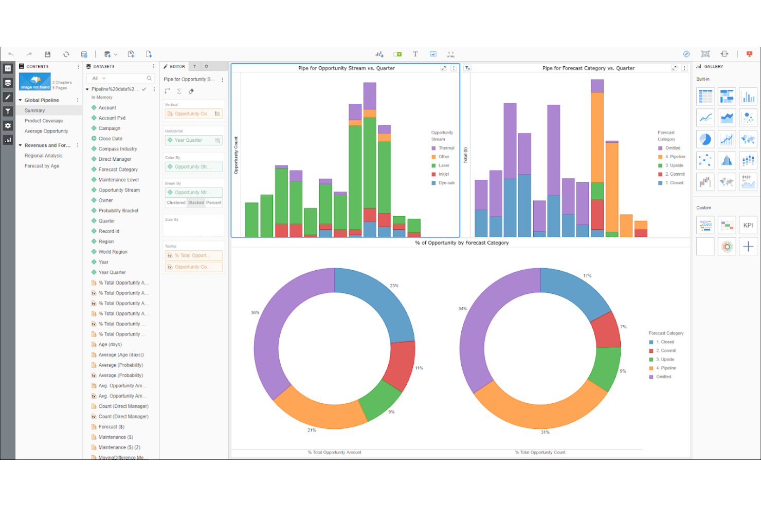
12 Tableau Alternatives for 2026

Tableau Alternatives Shortlist
Here’s my shortlist of Tableau alternatives:


A strong Tableau alternative offers advanced data visualization, flexible analytics, and smooth integration with your existing data sources—without the limitations or costs that might hold your team back. If you’re searching for business intelligence and data visualization software that matches or exceeds Tableau’s capabilities, you’re likely facing challenges with licensing, scalability, or specific feature gaps. This list will help you compare leading Tableau alternatives for 2026, so you can find the right fit for your organization’s analytics needs and make an informed decision about your next BI platform.
What Is Tableau?
Tableau is a business intelligence and data visualization software that helps users analyze, visualize, and share data insights through interactive dashboards and reports. It connects to a wide range of data sources, allowing teams to explore trends, identify patterns, and make data-driven decisions. Tableau is widely used by analysts, IT specialists, and business users who need to turn complex data into clear, actionable visualizations.
Best Tableau Alternatives Summary
This comparison chart summarizes pricing details for my top Tableau alternative selections to help you find the best one for your budget and business needs.
| Tool | Best For | Trial Info | Price | ||
|---|---|---|---|---|---|
| 1 | Best with cloud-based data pipelines | Free trial available | Pricing upon request | Website | |
| 2 | Best for embedded analytics customization | Free trial available | Pricing upon request | Website | |
| 3 | Best for Microsoft 365 integration | Free plan available | From $14/user/month (billed annually) | Website | |
| 4 | Best for open-source dashboard creation | Free plan available | From $100/month + $6/user/month | Website | |
| 5 | Best for complex data modeling flexibility | 7-day free trial available | From $399/month | Website | |
| 6 | Best for natural language search queries | 14-day free trial + free demo available | From $25/user/month (billed annually) | Website | |
| 7 | Best for SQL-based data querying | Not available | Pricing upon request | Website | |
| 8 | Best for spreadsheet-style data analysis | Free trial + free demo available | Pricing upon request | Website | |
| 9 | Best for enterprise-scale deployments | Free demo available | Pricing upon request | Website | |
| 10 | Best with associative data exploration | 30-day free trial available | From $300/month (billed annually) | Website |
Why Trust Our Software Reviews
-

Site24x7
Visit WebsiteThis is an aggregated rating for this tool including ratings from Crozdesk users and ratings from other sites.4.6 -
Docker
Visit WebsiteThis is an aggregated rating for this tool including ratings from Crozdesk users and ratings from other sites.4.6 -
Pulumi
Visit WebsiteThis is an aggregated rating for this tool including ratings from Crozdesk users and ratings from other sites.4.8


Tableau Alternatives Reviews
Below are my detailed summaries of the best Tableau alternatives that made it onto my shortlist. My reviews offer a detailed look at the features, capabilities, and integrations of each platform to help you find the best one for you.
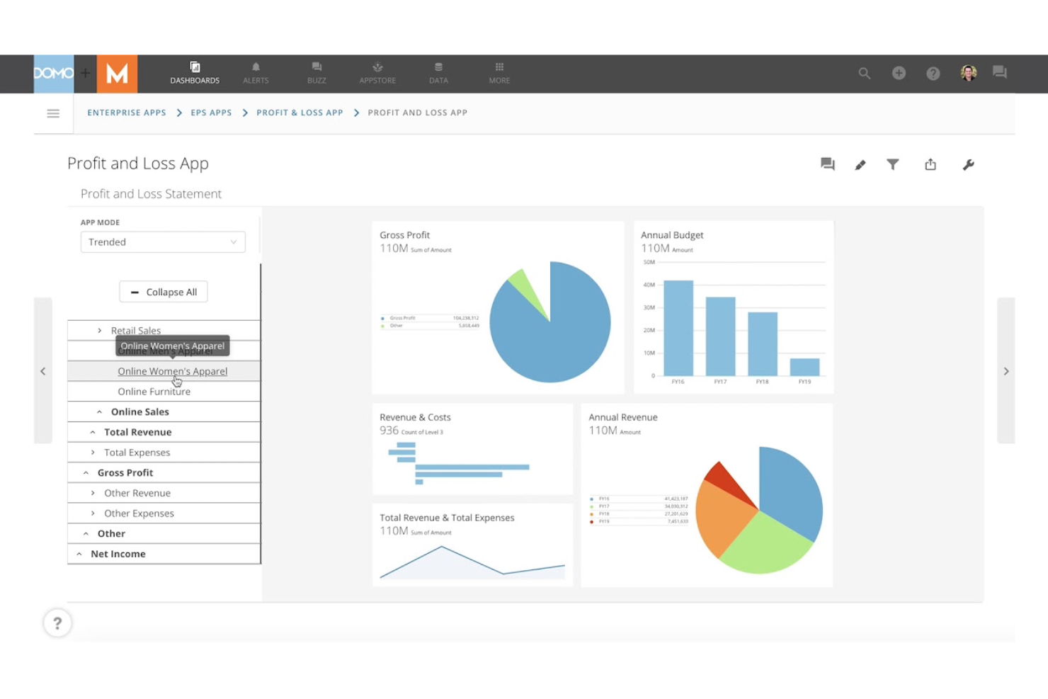
Domo is designed for organizations that need to connect, transform, and visualize data from a wide range of cloud sources. It’s especially useful for IT teams, data engineers, and large enterprises that want to automate data pipelines and manage real-time analytics at scale. Unlike Tableau, Domo offers built-in cloud data integration and workflow automation, so you can centralize data management and reporting in one platform. It also supports ad-hoc analysis, allowing business users to explore data and generate insights without waiting on IT.
Why Domo Is a Good Tableau Alternative
For teams that need to manage complex data flows from multiple cloud sources, Domo offers a unique advantage. I picked Domo because it combines cloud-based data pipeline automation with real-time analytics and visualization in one platform. You can use Domo’s ETL tools to build, schedule, and monitor data pipelines without relying on separate data engineering solutions. This makes it easier to keep your dashboards and reports up to date with the latest data from across your cloud ecosystem.
Domo Key Features
Some other features worth highlighting include:
- App Studio: Build and deploy custom data apps directly within the platform.
- Data Governance Controls: Set permissions, monitor usage, and manage data access across your organization.
- Mobile-Optimized Dashboards: Access and interact with dashboards from any mobile device.
- Alerting and Notifications: Set up automated alerts for data changes or anomalies.
Domo Integrations
Integrations include Salesforce, SAP, Excel, Google Sheets, BigQuery, MySQL, Snowflake, AWS, Oracle, and Shopify.
Pros and Cons
Pros:
- Built-in data governance and access controls
- Drag-and-drop interface for building data apps
- Native connectors for hundreds of cloud sources
Cons:
- Data prep features are less granular
- Limited advanced statistical analysis tools
Looker gives you a flexible cloud platform for building custom embedded analytics into your own products or workflows. This tool is a strong fit for SaaS providers, product teams, IT departments, and even non-technical users who need governed, self-service access to data. Unlike Tableau or lighter tools like Google Data Studio, Looker’s modeling layer and API-first approach provide extensive customization options, allowing you to integrate advanced data analytics tools directly into your applications. While it’s more enterprise-focused than a typical free version tool, it balances powerful customization with relative ease of use for teams building scalable analytics experiences.
Why Looker Is a Good Tableau Alternative
If you need deep customization for embedded analytics, Looker is a strong choice. I picked Looker because its semantic modeling layer lets you define and reuse business logic across dashboards and reports, making it easier to maintain consistency. The platform’s API-first design allows you to embed analytics directly into your own applications and tailor the user experience to your needs. These features make Looker especially appealing for teams that want to go beyond standard dashboards and deliver highly customized analytics solutions.
Looker Key Features
Some other features worth noting include:
- Scheduled Reporting: Automate report delivery to individuals or groups on a set schedule.
- Data Permissions Management: Control access to data and dashboards at a granular level.
- Version Control Integration: Connect with Git for managing and tracking changes to data models.
- Custom Visualizations: Build and deploy your own visualizations using JavaScript and the Looker extension framework.
Looker Integrations
Integrations include BigQuery, Snowflake, Redshift, Azure SQL Database, Google Sheets, PostgreSQL, MySQL, Oracle, Microsoft SQL Server, and Databricks.
Pros and Cons
Pros:
- Row-level security for granular data access
- Git-based version control for data models
- Strong API support for custom integrations
Cons:
- Requires SQL knowledge for most queries
- No drag-and-drop dashboard builder
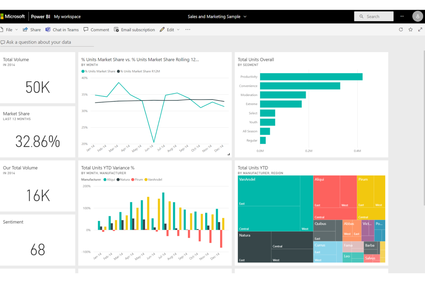
Power BI is a data visualization and data analytics platform designed for organizations that rely on Microsoft 365 and want tight integration with their existing workflows. It’s a strong fit for IT teams, business analysts, and data scientists who need to connect, model, and visualize data from a wide range of Microsoft and non-Microsoft sources. Microsoft Power BI stands out from Tableau by offering native integration with Excel, Teams, and Azure, making it easier to embed analytics, interactive graphs, and advanced analytics capabilities into daily business processes—all within a relatively user-friendly interface.
Why Power BI Is a Good Tableau Alternative
What sets Power BI apart as a Tableau alternative is its deep integration with Microsoft 365 tools. If your team already uses Excel, Teams, or SharePoint, you can embed Power BI dashboards directly into those environments for a unified analytics experience. I picked Power BI for its ability to leverage Azure Active Directory for secure access and its smooth data refresh from OneDrive and SharePoint. These features make it especially appealing for organizations invested in the Microsoft ecosystem and looking to centralize analytics within their daily workflows.
Power BI Key Features
Some other features in Power BI that are useful for business intelligence and data visualization teams include:
- Dataflow Creation: Build reusable data preparation workflows that can be shared across multiple reports and dashboards.
- AI-Powered Visualizations: Use built-in artificial intelligence to generate insights, detect anomalies, and create natural language queries.
- Custom Visual Marketplace: Access a library of third-party and custom visuals to extend the platform’s visualization options.
- Row-Level Security: Set granular access controls to restrict data visibility based on user roles and permissions.
Power BI Integrations
Integrations include Excel, Microsoft Teams, SharePoint, Azure SQL Database, Dynamics 365, Salesforce, Google Analytics, SAP HANA, Oracle Database, and GitHub.
Pros and Cons
Pros:
- Large library of custom visualizations
- Flexible data modeling with Power Query
- Built-in AI features for automated insights
Cons:
- Mobile app experience is less polished
- Performance can lag with large datasets
If you’re looking for an open-source way to build dashboards, Metabase offers a flexible platform for teams that want full control over their analytics environment. It’s especially appealing to IT specialists and data teams who prefer self-hosting, transparency, and the ability to customize or extend features. Unlike Tableau, Metabase stands out for its open-source model and straightforward setup for organizations that want to avoid vendor lock-in.
Why Metabase Is a Good Tableau Alternative
Unlike most proprietary BI tools, Metabase gives you the freedom to deploy and modify your dashboards as open-source software. I picked Metabase because it lets teams self-host, audit, and customize their analytics environment without relying on a vendor’s roadmap. The platform’s open-source nature means you can extend functionality, review code, and adapt the tool to fit unique security or compliance needs. This makes Metabase a strong choice for organizations that want transparency and control over their business intelligence stack.
Metabase Key Features
Some other features worth noting include:
- No-code Query Builder: Build queries and visualizations without writing SQL.
- Automated Dashboard Scheduling: Schedule dashboards and reports to be sent via email or Slack.
- Data Model Editor: Define relationships, metadata, and field visibility directly in the interface.
- Interactive Filters: Add dropdowns and date pickers to dashboards for dynamic exploration.
Metabase Integrations
Integrations include Amazon Redshift, Google BigQuery, Snowflake, Databricks, Microsoft SQL Server, PostgreSQL, MySQL, MongoDB, Google Sheets, and Oracle Database.
Pros and Cons
Pros:
- Supports embedding dashboards in other apps
- Self-hosting supports strict data governance
- Open-source codebase allows full transparency
Cons:
- Lacks native support for real-time data streaming
- No built-in support for row-level security
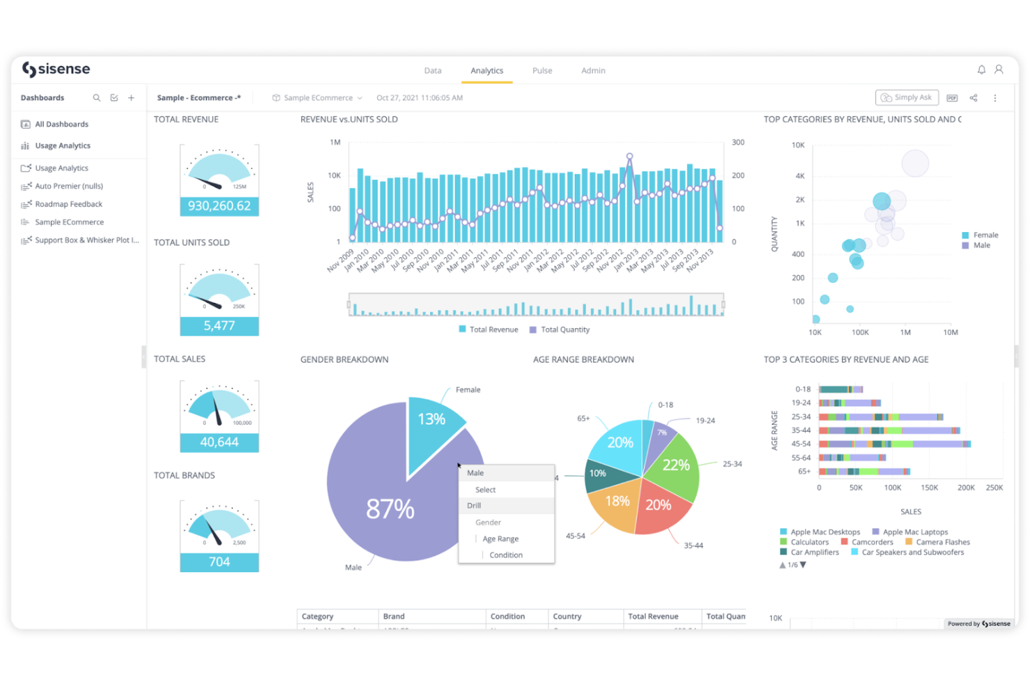
Sisense stands out for teams that need to build and manage highly customized data models across complex data environments. It’s a strong fit for IT specialists and data engineers who want to blend, transform, and analyze data from multiple sources without heavy reliance on SQL. Unlike Tableau, Sisense offers a flexible modeling layer that lets you handle intricate data relationships and embed analytics directly into your business applications.
Why Sisense Is a Good Tableau Alternative
If your team needs advanced control over data modeling, Sisense is worth considering. I picked Sisense because it lets you create complex, multi-source data models using its Elasticube technology and visual data modeling tools. You can define custom relationships, calculations, and transformations without being limited by rigid schema requirements. This flexibility is especially valuable for organizations with intricate data environments or those embedding analytics into their own products.
Sisense Key Features
Some other features that stand out include:
- White-Labeling and Embedding: Customize and embed analytics dashboards directly into your own applications or portals.
- AI-Driven Insights: Use built-in AI features to surface trends, anomalies, and predictive analytics.
- Role-Based Access Controls: Manage user permissions and data access at a granular level.
- Scheduled Reporting: Automate the delivery of reports to stakeholders on a set schedule.
Sisense Integrations
Integrations are not publicly listed.
Pros and Cons
Pros:
- Role-based access ensures granular data security
- Embeddable dashboards support custom applications
- Elasticube engine enables complex data modeling
Cons:
- Limited out-of-the-box visualization types
- Data refreshes can be slow with large sets
ThoughtSpot takes a search-driven approach to business intelligence, letting you analyze data using natural language queries. This data visualization tool is especially useful for business teams, analysts, IT specialists, and even small businesses that want fast, self-service analytics without relying on SQL or complex dashboard building. With its intuitive interface and AI-powered search, ThoughtSpot simplifies data processing and makes it easy to surface insights from large datasets just by typing questions in plain English.
Why ThoughtSpot Is a Good Tableau Alternative
For teams that want to analyze data using natural language, ThoughtSpot offers a unique approach compared to Tableau. I picked ThoughtSpot because its search-driven analytics let you type questions in plain English and instantly get visual answers from your data. The platform’s AI-powered query engine interprets complex questions and automatically generates charts or tables, removing the need for manual dashboard creation. This makes ThoughtSpot a strong fit for organizations that want to empower more users to explore data without technical barriers.
ThoughtSpot Key Features
Some other features worth highlighting include:
- Live Analytics on Cloud Data: Connect directly to cloud data warehouses for real-time analysis.
- Pinboards: Organize and share collections of charts and insights in customizable dashboards.
- Data Modeling Tools: Define relationships and hierarchies within your datasets for more meaningful analysis.
- Role-Based Access Controls: Set granular permissions for users and groups to manage data access securely.
ThoughtSpot Integrations
Integrations include Snowflake, Google BigQuery, Amazon Redshift, Databricks, Microsoft Azure Synapse, Google Sheets, Amazon S3, Oracle, SAP HANA, and Teradata.
Pros and Cons
Pros:
- Pinboards for sharing curated analytics views
- AI-driven suggestions for query refinement
- Natural language search for instant insights
Cons:
- Scheduled reporting options are less flexible
- No on-premises deployment for self-hosting
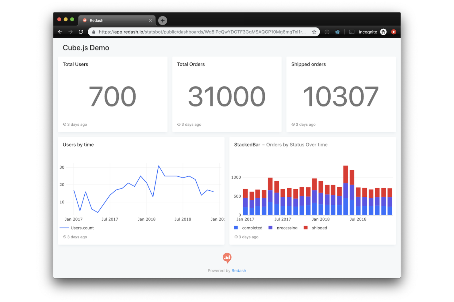
Redash is designed for teams that want direct, SQL-based access to their data without extra layers of abstraction. It’s a strong fit for IT specialists, data engineers, and analysts who prefer writing queries and need to visualize results quickly. Unlike Tableau, Redash emphasizes raw SQL querying and collaboration, making it ideal for organizations that want to stay close to their data sources and logic.
Why Redash Is a Good Tableau Alternative
For teams that want to work directly with SQL, Redash offers a focused environment for querying and visualizing data. I picked Redash because it lets you write, save, and share SQL queries without hiding the underlying logic behind drag-and-drop interfaces. The platform supports query parameterization and result caching, which helps you build dynamic dashboards and reduce database load. This approach appeals to technical users who want transparency and control over their data analysis process.
Redash Key Features
Some other features worth highlighting include:
- Visualization Gallery: Choose from a variety of chart types to display query results.
- Alerting System: Set up alerts based on query results and receive notifications via email or chat.
- Dashboard Sharing: Share dashboards with team members or generate public links for external stakeholders.
- Data Source Management: Connect and manage multiple databases from a single interface.
Redash Integrations
Integrations include Amazon Redshift, Google BigQuery, Snowflake, Databricks, Microsoft SQL Server, MongoDB, MySQL, Oracle, Salesforce, and Google Analytics.
Pros and Cons
Pros:
- Query results can be shared via public links
- Supports scheduled queries and automated alerts
- Direct SQL editing for full query control
Cons:
- No built-in data preparation or blending tools
- No drag-and-drop report builder available
Sigma offers a spreadsheet-style interface for cloud analytics, making it familiar for anyone comfortable with Excel or Google Sheets. This business intelligence platform is a strong fit for business analysts, finance teams, and IT specialists who want to perform business analytics directly on live data in a collaborative environment. Unlike Tableau, Sigma lets you build calculations and visualizations using spreadsheet formulas, so you can analyze large datasets without writing SQL. While advanced modeling features may involve a steep learning curve, their familiar layout helps teams adopt cloud analytics more quickly.
Why Sigma Is a Good Tableau Alternative
If you want a business intelligence tool that feels like working in a spreadsheet, Sigma is worth considering. I picked Sigma because it lets you use familiar spreadsheet formulas and functions directly on live cloud data, which is something Tableau doesn’t offer. You can build calculations, pivot tables, and visualizations without writing SQL, making it accessible for teams who already rely on spreadsheets for analysis. This approach helps bridge the gap between traditional spreadsheet workflows and modern data visualization needs.
Sigma Key Features
Some other features that stand out include:
- Live Data Connections: Connect directly to cloud data warehouses for up-to-date analysis.
- Collaboration Tools: Share workbooks and dashboards with team members in real time.
- Row-Level Security: Control data access at a granular level for different users.
- Audit Trails: Track changes and user activity within your analytics environment.
Sigma Integrations
Integrations include Snowflake, Databricks, AWS, Azure, and Google Cloud.
Pros and Cons
Pros:
- Audit trails track changes and user actions
- Built-in row-level security for data access
- No SQL required for complex calculations
Cons:
- Mobile experience is less feature-rich
- No offline mode for data analysis
Designed for organizations with large-scale analytics needs, Strategy offers a platform built for enterprise-wide deployments and governance. It’s a strong choice for IT leaders and data teams who need to manage complex security, compliance, and scalability requirements across global operations. Unlike Tableau, Strategy emphasizes centralized administration, federated analytics, and mobile capabilities for distributed workforces.
Why Strategy Is a Good Tableau Alternative
For teams managing analytics at a global scale, Strategy offers capabilities that go beyond what Tableau provides. I picked Strategy because it supports centralized governance, multi-tenant architecture, and advanced security controls that are essential for enterprise deployments. The platform’s federated analytics let you manage and distribute insights across multiple business units while maintaining strict compliance. These features make it a strong fit for organizations that need to standardize analytics and reporting across complex, distributed environments.
Strategy Key Features
Some other features worth highlighting include:
- HyperIntelligence Cards: Surface contextual insights directly within web applications and productivity tools.
- Pixel-Perfect Report Designer: Create highly formatted, print-ready reports for regulatory or executive use.
- Mobile App Builder: Develop custom analytics apps for iOS and Android devices.
- Natural Language Queries: Allow users to ask questions and generate visualizations using everyday language.
Strategy Integrations
Integrations include Amazon Redshift, Azure Synapse Analytics, Databricks, Google BigQuery, Snowflake, SAP HANA, Salesforce, Oracle Database, Microsoft SQL Server, and Dropbox.
Pros and Cons
Pros:
- Supports multi-tenant architecture for large organizations
- Centralized administration for global deployments
- HyperIntelligence cards deliver insights in context
Cons:
- Natural language query accuracy varies by dataset
- Upgrades can disrupt existing deployments
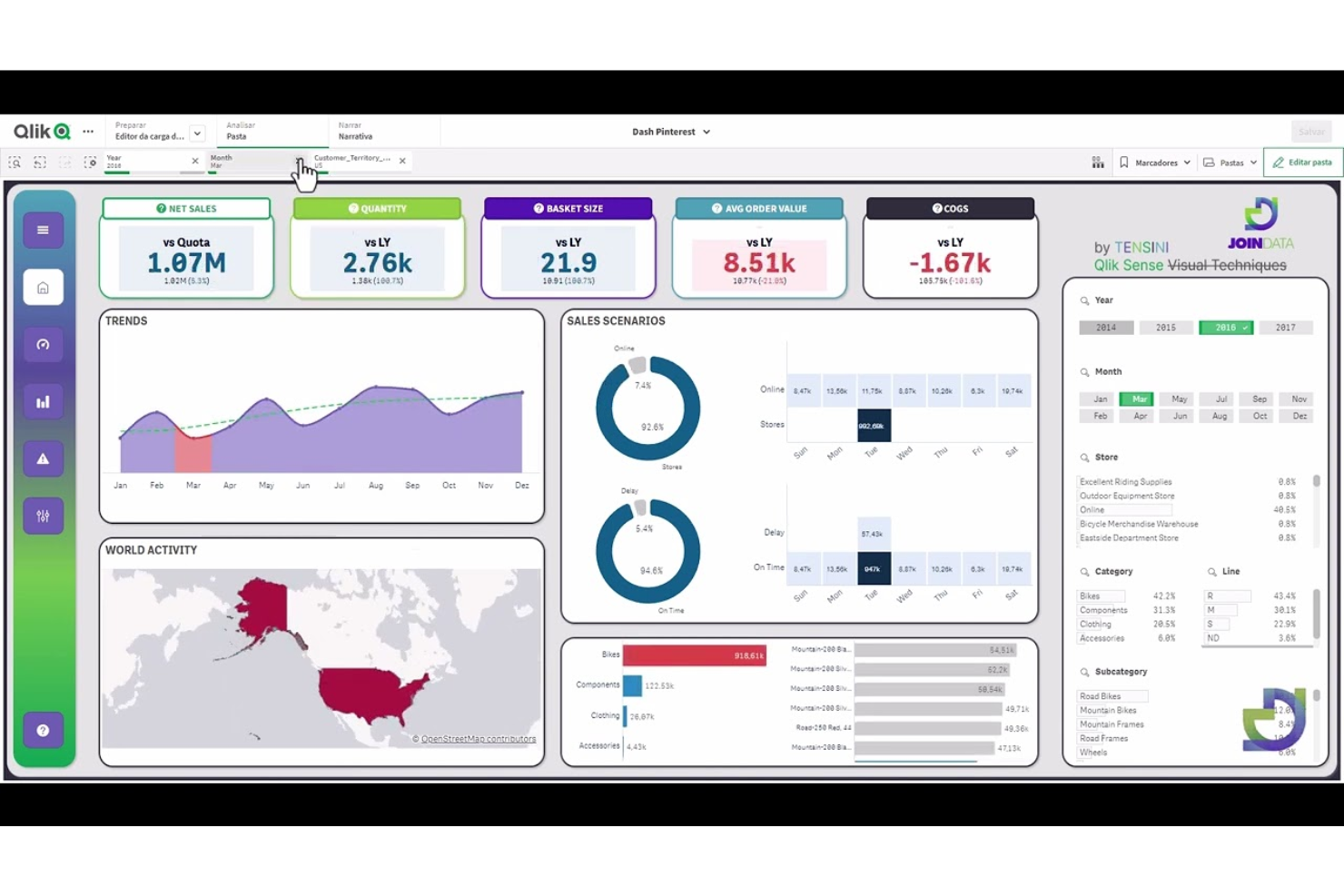
Qlik Sense takes a unique approach to data analysis with its associative data exploration engine. This platform is well-suited for IT teams and analysts who need to uncover hidden relationships across complex, multi-source datasets. Unlike Tableau, Qlik Sense lets you freely explore data connections without being limited to predefined query paths.
Why Qlik Sense Is a Good Tableau Alternative
Qlik Sense stands out for its associative data exploration, which lets you investigate data relationships from any angle without being restricted to linear queries. I picked Qlik Sense because its in-memory engine instantly recalculates visualizations as you select different data points, revealing connections you might otherwise miss. The platform’s Smart Search feature also helps you quickly surface relevant data across multiple sources. These capabilities make Qlik Sense a strong choice for teams that need to dig deeper into complex datasets than Tableau typically allows.
Qlik Sense Key Features
In addition to its associative data exploration, Qlik Sense offers several other features that support business intelligence work:
- Self-Service Data Preparation: Users can load, transform, and combine data from multiple sources without relying on IT.
- Responsive Design: Dashboards and reports automatically adjust to fit any device, including desktops, tablets, and smartphones.
- Embedded Analytics: Integrate Qlik Sense visualizations directly into other applications or web portals.
- Alerting and Automated Actions: Set up data-driven alerts and trigger automated workflows based on specific conditions.
Qlik Sense Integrations
Integrations are not publicly listed.
Pros and Cons
Pros:
- Built-in alerting supports proactive monitoring
- In-memory processing enables fast data analysis
- Smart Search finds relevant data across sources
Cons:
- Data preparation tools can feel fragmented
- Fewer prebuilt visualizations than Tableau
Other Tableau Alternatives
Here are some additional Tableau alternatives that didn’t make it onto my shortlist, but are still worth checking out:
- Zoho Analytics
For automated data blending
- DashboardFox
For self-hosted deployment options


Tableau Alternatives Selection Criteria
When selecting the best Tableau alternatives to include in this list, I considered common buyer needs and pain points related to Business Intelligence and Data Visualization Software products, like supporting direct data source connections and enabling flexible dashboard creation. I also used the following framework to keep my evaluation structured and fair:
Core Functionality (25% of total score)
To be considered for inclusion in this list, each solution had to fulfill these common use cases:
- Connect to multiple data sources
- Create interactive dashboards
- Build custom data visualizations
- Schedule and automate reports
- Share dashboards with stakeholders
Additional Standout Features (25% of total score)
To help further narrow down the competition, I also looked for unique features, such as:
- Built-in machine learning analytics
- Natural language query support
- Real-time data streaming
- Embedded analytics for external apps
- Advanced data governance controls
Usability (10% of total score)
To get a sense of the usability of each system, I considered the following:
- Clean and intuitive user interface
- Logical workflow for building reports
- Responsive dashboard performance
- Customizable workspace layouts
- Accessibility for users with different skill levels
Onboarding (10% of total score)
To evaluate the onboarding experience for each platform, I considered the following:
- Step-by-step product tours
- Availability of training videos and guides
- Pre-built dashboard templates
- In-app chatbots or help widgets
- Access to live or recorded webinars
Customer Support (10% of total score)
To assess each software provider’s customer support services, I considered the following:
- 24/7 support availability
- Multiple support channels offered
- Fast response times to inquiries
- Access to a user community or forum
- Quality of technical documentation
Value For Money (10% of total score)
To evaluate the value for money of each platform, I considered the following:
- Transparent and flexible pricing plans
- Features included at each pricing tier
- Free trial or free plan availability
- Discounts for annual billing or volume
- No hidden fees or surprise charges
Customer Reviews (10% of total score)
To get a sense of overall customer satisfaction, I considered the following when reading customer reviews:
- Positive feedback on reliability and uptime
- Praise for visualization and reporting features
- Comments on ease of integration with data sources
- Reports of helpful and knowledgeable support
- Critiques of any recurring issues or limitations
Why Look For a Tableau Alternative?
While Tableau is a good choice of Business Intelligence and Data Visualization Software, there are a number of reasons why some users seek out alternative solutions. You might be looking for a Tableau alternative because…
- You need direct SQL access for custom queries
- Your team prefers open-source or self-hosted tools
- You want lower licensing or deployment costs
- You require more flexible integration with niche data sources
- You need simpler user management for large organizations
- You want faster dashboard performance with large datasets
If any of these sound like you, you’ve come to the right place. My list contains several Business Intelligence and Data Visualization Software options that are better suited for teams facing these challenges with Tableau and looking for alternative solutions.
Tableau Key Features
Here are some of the key features of Tableau, to help you contrast and compare what alternative solutions offer:
- Drag-and-drop dashboard and report builder
- Wide range of data connectors for cloud and on-premises sources
- Interactive data visualizations and charts
- Real-time data analysis and live data connections
- Advanced calculated fields and data blending
- Built-in geospatial mapping and location analytics
- Automated data refresh and scheduling
- Collaboration tools for sharing dashboards and reports
- Role-based access controls and permissions
- Integration with Tableau Prep for data preparation
What’s Next:
If you're in the process of researching Tableau alternatives, connect with a SoftwareSelect advisor for free recommendations.
You fill out a form and have a quick chat where they get into the specifics of your needs. Then you'll get a shortlist of software to review. They'll even support you through the entire buying process, including price negotiations.