
Enquanto pessoa que trabalhou extensivamente com alternativas ao Bootstrap, compreendo o atrativo de uma estrutura que oferece uma grande variedade de plug-ins, modelos e nomes de classes intuitivos, juntamente com a eficiência do CSS3 na criação de aplicações Web. As alternativas ao Bootstrap que vou abordar oferecem uma estrutura de front-end responsiva que mantém a compatibilidade entre vários navegadores e melhora o aspeto dos elementos HTML, garantindo assim a manutenção do seu código-fonte e melhorando os elementos da interface do utilizador.
Se teve dificuldades com as complexidades do design de front-end, lidando com problemas de compatibilidade entre diferentes navegadores e dispositivos ou mantendo a qualidade do seu código-fonte, esta ferramenta foi concebida para aliviar essas dificuldades. Recomendo que experimente estas alternativas ao Bootstrap — pode ser que encontre precisamente a solução que procurava.
O que é o Bootstrap?
O Bootstrap é uma ferramenta de desenvolvimento Web de front-end que ajuda a criar sites responsivos utilizando componentes HTML, CSS e JavaScript pré-criados. Designers, programadores de front-end e equipas de produto utilizam-no para acelerar o design da interface do utilizador e garantir que os seus esquemas funcionam em todos os tamanhos de ecrã. Os sistemas de grelha, os componentes reutilizáveis e as classes concebidas para dispositivos móveis em primeiro lugar ajudam no esquema da página, no estilo e na capacidade de resposta. De um modo geral, o Bootstrap facilita a criação de interfaces limpas e funcionais pela sua equipa, sem ter de começar do zero.
Why Trust Our Software Recommendations
6,700+
Reviews
20
Industry experts
16+
Evaluation factors
14
Years
Our team has been testing and reviewing software since 2012. As tech leaders ourselves, we know how difficult—and important—it is to choose the right software.
For this guide, we evaluated tools using hands-on testing and independent research, scoring tools using our selection criteria.
Our reviews reflect our human editorial judgment, not a sales pitch.
Expert reviewers:
- Paulo Gardini MiguelTech Director
 Tim FisherVP of AI
 Gabriel RosasTech Lead & Software Architect
 Christhian GruhnTech Lead & Platform Architect

Tabela de comparação: alternativas ao Bootstrap
Esta tabela de comparação resume os detalhes de preços das minhas principais escolhas de alternativas ao Bootstrap.
| Tool | Best For | Trial Info | Price | ||
|---|---|---|---|---|---|
| 1 | Best for custom designs without default styling | Free plan available | Pricing upon request | Website | |
| 2 | Best for projects needing a minimal CSS footprint | Free plan available | Pricing upon request | Website | |
| 3 | Best for React teams ditching Bootstrap's defaults | Free plan available | From $24.92/user/month (billed annually) | Website | |
| 4 | Best for its powerful CSS framework based on Flexbox | Free plan available | Pricing upon request | Website | |
| 5 | Best for its intuitive and expansive component library | Free plan available | Pricing upon request | Website | |
| 6 | Best for semantic, human-friendly HTML class naming | Free plan available | Pricing upon request | Website | |
| 7 | Best for Vue teams building Material Design apps | Free plan available | From $2.50/month (billed annually) | Website | |
| 8 | Best for tiny sites needing zero-JS styling | Free plan available | Pricing upon request | Website | |
| 9 | Best for startups looking for pre-made components | Not available | Pricing upon request | Website | |
| 10 | Best for minimalistic designs and smaller file sizes | Free plan available | Pricing upon request | Website |




Avaliações das melhores alternativas ao Bootstrap
Seguem-se os meus resumos detalhados das melhores alternativas ao Bootstrap que entraram na minha lista restrita. As minhas avaliações apresentam uma análise detalhada das principais funcionalidades, vantagens e desvantagens, integrações e casos de utilização ideais de cada ferramenta, para ajudar a encontrar a melhor opção para si.
 Best for custom designs without default styling
- Free plan available
- Pricing upon request
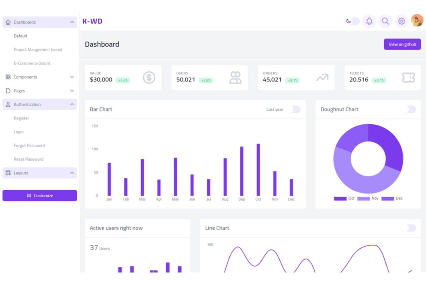
K-WD offers a pre-built dashboard template styled with Tailwind CSS. Tailwind CSS is a CSS framework for web and product teams that want to build branded interfaces, adapt layouts to specific workflows, and move beyond Bootstrap’s preset component styles.
Who Is Tailwind CSS Best For?
Frontend developers who want to style web interfaces directly in their markup and keep design decisions close to the code.
Why I Picked Tailwind CSS
Tailwind CSS earns my pick as Best for custom designs with its low-level utility classes. I use its utility classes to build layouts and component styles directly in markup, rather than starting from Bootstrap’s preset components. Responsive and state variants let me tailor a dashboard’s layout across screen sizes and style controls for hover and focus states.
Tailwind CSS Key Features
- Preflight: Applies a consistent set of base styles across browsers.
- Theme customization: Define colors, fonts, and spacing in the theme.
- Plugin API: Add custom utilities and components to the framework.
- Build-time generation: Generates CSS for classes detected in your source files.
Tailwind CSS Integrations
Tailwind CSS supports official Vite and PostCSS plugins, with setup guides for Laravel, SvelteKit, React Router, Nuxt, SolidJS, Next.js, and Angular. It also offers a CLI installation path for other build environments.
Pros and Cons
Pros:
- Production CSS includes only detected utility classes
- Responsive and state variants stay beside markup
- Custom layouts avoid preset component styling
Cons:
- No prebuilt components for quick page assembly
- Long utility lists clutter component markup
Learn more about Tailwind CSS: Best for projects needing a minimal CSS footprint
- Free plan available
- Pricing upon request
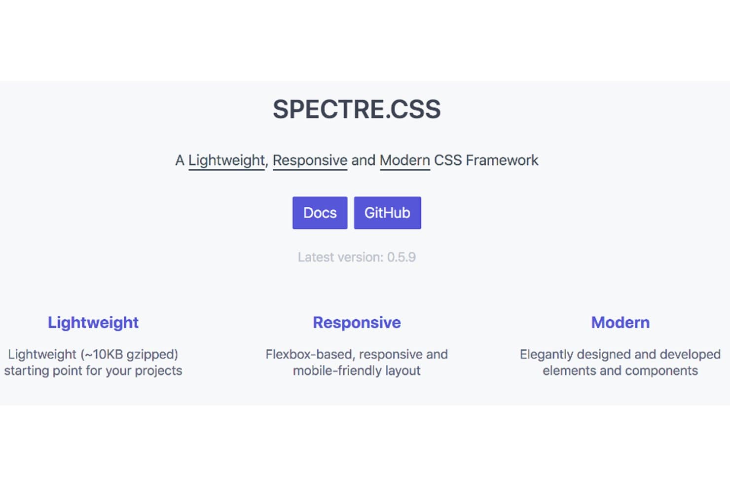
SPECTRE.CSS offers a lightweight, responsive, modern CSS framework. For teams seeking a Bootstrap alternative, SPECTRE.CSS is a CSS framework for responsive interfaces and is Best for modern and flexible designs in lightweight packages.
Who Is SPECTRE.CSS Best For?
Frontend developers building responsive web interfaces who want a compact CSS toolkit they can adapt to project needs.
Why I Picked SPECTRE.CSS
I picked SPECTRE.CSS for its fit as “Best for modern and flexible designs in lightweight packages.” Its flexbox-based responsive grid adapts an operations dashboard across laptop and tablet screens, while CSS components cover forms, navigation, and alerts.
SPECTRE.CSS Key Features
- Typography styles: Apply styles to headings, paragraphs, blockquotes, and lists.
- Table styles: Format tables and data sets with built-in CSS classes.
- Code formatting: Style inline code and multiline code snippets.
- Display utilities: Show or hide elements with display utility classes.
SPECTRE.CSS Integrations
SPECTRE.CSS doesn’t have any native integrations; it’s a CSS framework you add to your frontend project.
Pros and Cons
Pros:
- Pure CSS components avoid JavaScript dependencies
- Flexbox grid adapts across screen sizes
- Small footprint keeps page assets lean
Cons:
- Interactive behaviors require your own JavaScript
- Fewer component variants than Bootstrap
Learn more about SPECTRE.CSS: 3Best for React teams ditching Bootstrap's defaults
MUI
- Free plan available
- From $24.92/user/month (billed annually)
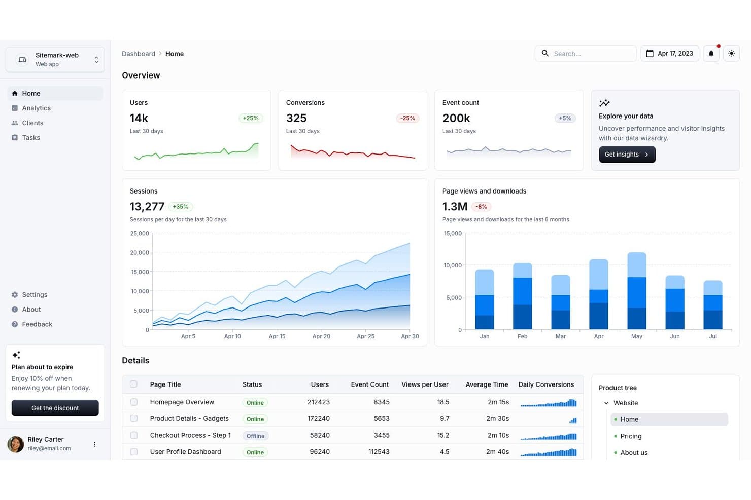
MUI's dashboard template helps users visualize analytics data at a glance. For React teams building internal portals or admin consoles, MUI is a component library with reusable interface elements and styling tools that reduce the work of creating consistent screens from scratch.
Who Is MUI Best For?
MUI suits frontend developers building React applications who need a component system they can adapt to their product’s visual standards.
Why I Picked MUI
I picked MUI because its Material UI components give React apps a Bootstrap alternative built around reusable controls rather than utility classes. I like its theme system for applying consistent colors and component styles across admin screens, while its React components fit popular React-based application stacks.
MUI Key Features
- CSS baseline: CSSBaseline applies a consistent reset and default styles across browsers.
- Responsive Grid layouts: Set column sizes at different breakpoints with Grid props.
- Data Grid: Display tabular data with built-in sorting, filtering, and pagination.
- Date and time pickers: Add input components for selecting dates, times, or both.
MUI Integrations
MUI provides official example projects for Next.js, Vite, Remix, Gatsby, Express, Preact, and Tailwind CSS. These are framework and library setup examples, not a catalog of third-party integrations; Emotion is the default styling engine, with styled-components available as an alternative.
Pros and Cons
Pros:
- Built-in Data Grid handles sorting and pagination
- Theme tokens keep screens visually consistent
- React components speed up admin screen builds
Cons:
- Default Material aesthetic can constrain brand differentiation
- Deep styling overrides take extra maintenance
Learn more about MUI: Best for its powerful CSS framework based on Flexbox
- Free plan available
- Pricing upon request
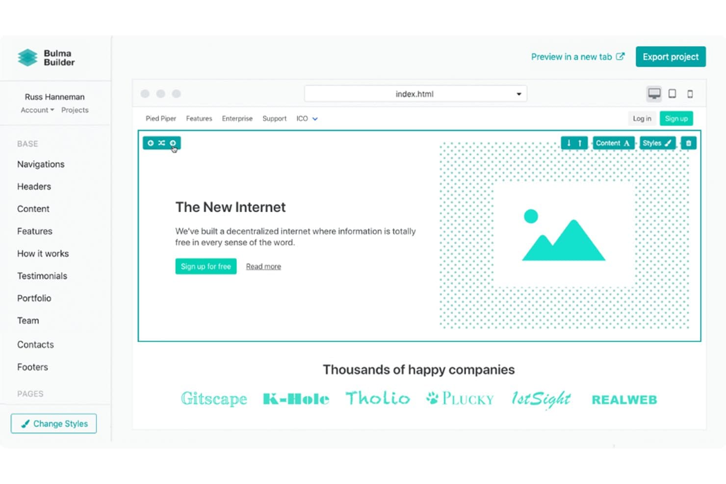
Bulma Builder lets users visually assemble web pages with drag-and-drop blocks. Bulma gives IT and web teams a CSS framework for responsive dashboards, support portals, and internal tools, with a class-based approach that helps keep interfaces consistent without adding a JavaScript component layer.
Who Is Bulma Best For?
Bulma suits front-end developers and IT teams building responsive web interfaces with CSS classes rather than a JavaScript component framework.
Why I Picked Bulma
Bulma is Best for its powerful CSS framework based on Flexbox, and I picked it as a Bootstrap alternative for responsive, class-driven layouts. Its column system and breakpoint modifiers help me build an internal support dashboard that adapts from desktop to mobile without adding a JavaScript component layer.
Bulma Key Features
- Form controls : Includes styles for inputs, checkboxes, selects, and textareas.
- Cards : Provides card layouts with headers, content, and footers.
- Navbar : Offers navigation bars with brand, menu, and item elements.
- Visibility helpers : Includes classes to show or hide elements at specific screen sizes.
Bulma Integrations
Bulma doesn’t have any native integrations; it’s a CSS framework you add to a web project rather than a platform with connected apps.
Pros and Cons
Pros:
- No JavaScript dependency keeps CSS-only apps lean
- Sass variables support theme customization
- Flexbox columns adapt across screen sizes
Cons:
- Modern CSS limits legacy-browser support
- Interactive controls need custom JavaScript
Learn more about Bulma: Best for its intuitive and expansive component library
- Free plan available
- Pricing upon request
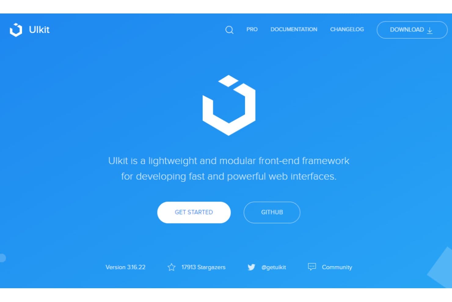
UIkit offers a lightweight front-end framework for fast web interfaces. UIkit is a front-end CSS framework for web teams that need responsive, consistent interfaces without building every layout and interaction from scratch.
Who Is UIkit Best For?
UIkit suits frontend developers building responsive websites and web applications who want a ready-made set of interface components.
Why I Picked UIkit
I picked UIkit as a Bootstrap alternative for its intuitive and expansive component library, including navbar, off-canvas, and modal components. I use these with its responsive grid to build admin interfaces with collapsible navigation and dialog-based workflows without assembling each pattern from scratch.
UIkit Key Features
- Form styling: Apply styles to inputs, selects, textareas, checkboxes, and radio buttons.
- Table component: Add consistent styling to tables with UIkit’s table classes.
- Icon component: Insert SVG icons with the
uk-iconattribute. - Utility classes: Set spacing, text alignment, visibility, and widths with CSS classes.
UIkit Integrations
UIkit doesn’t have clearly documented native integrations; its JavaScript API supports custom component behavior, and its documentation covers use with Vue.js and React.
Pros and Cons
Pros:
- Form, table, and icon components included
- Responsive grid and utility classes cover layouts
- Ready-made navbar, modal, and off-canvas patterns
Cons:
- Audit keyboard and screen-reader behavior carefully
- Smaller community than Bootstrap's
Learn more about UIkit: Best for semantic, human-friendly HTML class naming
- Free plan available
- Pricing upon request
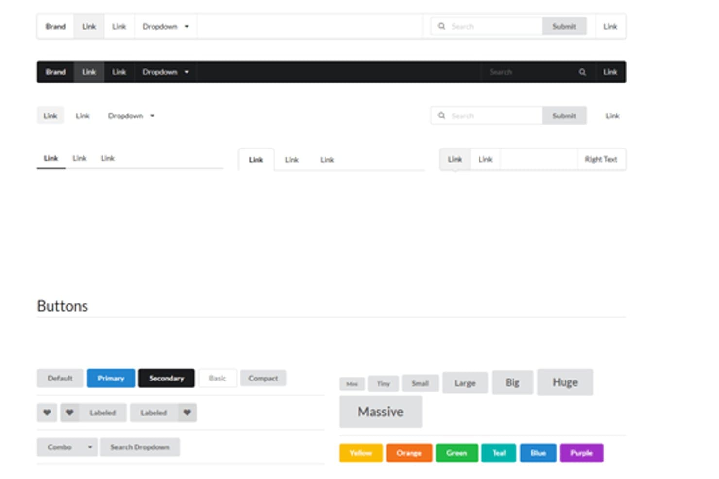
Semantic UI offers flexible navbar and button component themes. Semantic UI is a front-end framework for building consistent web interfaces, giving product and IT teams a component system when Bootstrap’s conventions don’t fit their design or workflow.
Who Is Semantic UI Best For?
Front-end developers building web interfaces who want readable HTML classes and a ready-made component framework.
Why I Picked Semantic UI
I picked Semantic UI, Best for user-friendly designs with its human-friendly HTML, because its class names read clearly in page markup. Classes such as
ui button,ui form, andui menumake admin screens easier to review and update. Its grid and component styles give me a readable alternative to Bootstrap’s conventions.Semantic UI Key Features
- Form validation: Set field rules and display validation messages through the form validation module.
- Dropdown module: Create searchable, multi-select, and selection dropdowns.
- Modal module: Configure dialog actions, transitions, and dismissal behavior.
- Theming system: Customize styles by overriding LESS variables and theme files.
Semantic UI Integrations
Semantic UI documents framework integrations for React, Angular, Meteor, and Ember, with Semantic UI React identified as its official React integration. It doesn’t list native integrations with external business tools.
Pros and Cons
Pros:
- LESS variables support layered theme overrides
- Built-in modules cover common interface patterns
- Readable classes keep markup self-explanatory
Cons:
- Documentation gaps can send developers to source code
- Inconsistent maintenance raises long-term upgrade risk
Learn more about Semantic UI: Best for Vue teams building Material Design apps
- Free plan available
- From $2.50/month (billed annually)
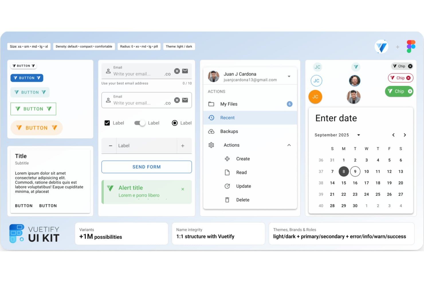
Vuetify offers ready-made UI components for rapid app development. For IT teams building internal portals or customer-facing apps with Vue, Vuetify provides a Material Design component framework that helps standardize interfaces and reduce the work of styling common UI patterns.
Who Is Vuetify Best For?
Frontend teams building Vue-based web apps can use Vuetify’s Material Design components to create consistent, feature-rich single-page interfaces.
Why I Picked Vuetify
I picked Vuetify for this use case: “Best for building rich single-page applications with Vue.js.” Its Vue components follow Material Design, and its responsive grid helps structure application layouts. I like using components such as data tables and navigation drawers to build internal admin portals without assembling those interface patterns from scratch.
Vuetify Key Features
- Theme modes: Configure light, dark, or system themes and define custom colors.
- CSS utility classes: Apply spacing, flex, display, and text styles in markup.
- Sass variables: Customize framework-wide and component-level styling variables.
- Icon font support: Use libraries such as Material Design Icons, Font Awesome, Lucide, and Tabler.
Vuetify Integrations
Vuetify doesn’t list native third-party integrations, but its documentation explains how to connect vue-i18n and share translations between the libraries.
Pros and Cons
Pros:
- Responsive grid supports complex app layouts
- Data tables and drawers suit admin portals
- Vue-native components reduce integration glue
Cons:
- Custom styling can require component overrides
- Material Design constrains visual direction
Learn more about Vuetify: Best for tiny sites needing zero-JS styling
- Free plan available
- Pricing upon request
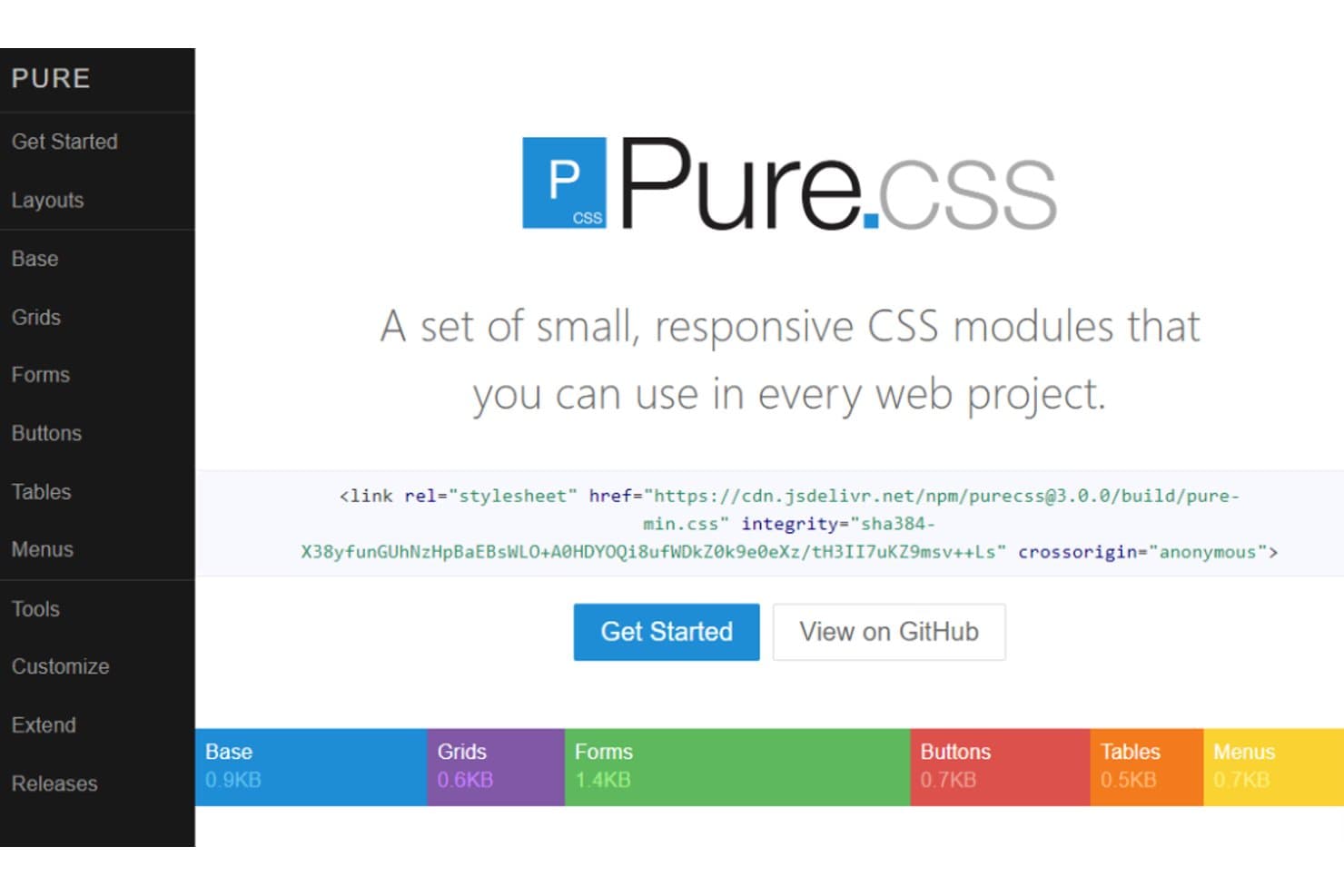
Pure.css offers small, responsive CSS modules for any web project. Pure.css is a modular CSS framework for developers and IT teams that need a simple foundation for consistent, responsive interfaces without adopting a larger framework’s extensive component system.
Who Is Pure.css Best For?
Pure.css suits front-end developers and IT teams building responsive websites who want a small CSS foundation without adopting a full component framework.
Why I Picked Pure.css
I picked Pure.css as “Best for streamlined performance with its tiny footprint” because its small, modular CSS lets me add only what a page needs. Its responsive grids and form styles suit lightweight internal dashboards that need to work across screen sizes. I can leave out modules the project doesn’t use.
Pure.css Key Features
- Button styles: Provides classes for default, primary, disabled, and grouped buttons.
- Table styles: Adds bordered and striped table options through CSS classes.
- Menu styles: Supports horizontal, vertical, and dropdown menu layouts.
- Responsive images: The
pure-imgclass scales images to fit their containers.
Pure.css Integrations
Pure.css doesn’t have native integrations. You can add it to a project through npm or Composer, or load it from the jsDelivr CDN; its documentation recommends npm for build processes.
Pros and Cons
Pros:
- Minimal defaults are easy to extend
- Responsive grids suit mobile-first internal tools
- Tiny modular downloads limit CSS payload
Cons:
- Grid class naming takes some adjustment
- Few prebuilt components compared with Bootstrap
Learn more about Pure.css: Best for startups looking for pre-made components
- Not available
- Pricing upon request
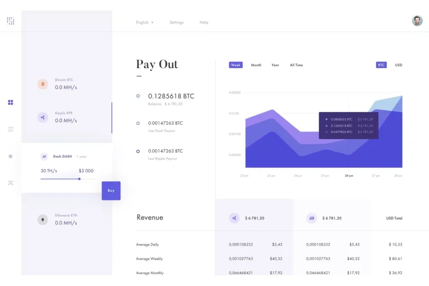
Bulkit tracks crypto payouts and revenue with a clean dashboard UI. Bulkit is a Bulma-based front-end UI kit for startup teams that need a ready foundation for responsive web apps and marketing sites without building every interface element from scratch.
Who Is Bulkit Best For?
Bulkit suits startup frontend teams building with Bulma who want ready-made interface sections for product sites and web apps.
Why I Picked Bulkit
I picked Bulkit as a Bootstrap alternative because it’s best for startups looking for pre-made components. Built on Bulma, it includes ready-made interface sections for responsive web apps and marketing sites, so I can assemble a product landing page or app interface without creating every section from scratch.
Bulkit Key Features
- Handlebars templates: Panini combines shared layouts, partials, helpers, and JSON data into HTML pages.
- Sass build: Gulp compiles Sass and adds vendor prefixes with Autoprefixer.
- BrowserSync development server: Changes to pages reload the browser, while Sass edits inject CSS live.
- Production asset compression: The build can compress CSS, JavaScript, and images.
Bulkit Integrations
Bulkit doesn’t have any native integrations.
Pros and Cons
Pros:
- Responsive Bulma layouts suit web apps
- Modular Sass supports theme adjustments
- 160 demo pages cover startup use cases
Cons:
- Static HTML requires app integration
- Latest release dates to February 2024
Learn more about Bulkit: 10Best for minimalistic designs and smaller file sizes
Tachyons
- Free plan available
- Pricing upon request
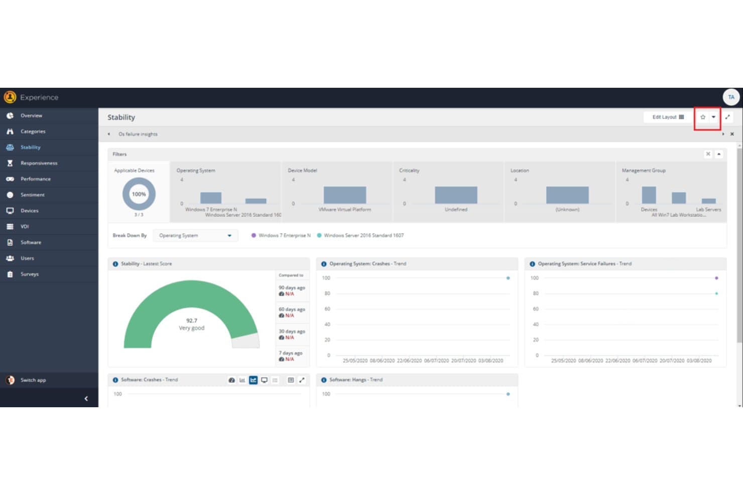
Tachyons displays device stability scores and OS crash trends in a dashboard. Tachyons is an open-source, utility-first CSS framework for front-end developers who want to build custom interfaces without relying on Bootstrap’s predefined component patterns.
Who Is Tachyons Best For?
Tachyons suits front-end teams building lightweight websites that need simple, consistent styling with little CSS overhead.
Why I Picked Tachyons
I picked Tachyons for minimalistic designs and smaller file sizes: its single-purpose utility classes let me style layouts without Bootstrap’s predefined components. I use its responsive classes for compact pages that adapt across screen sizes while keeping the CSS footprint small.
Tachyons Key Features
- Typography: Classes set font sizes, weights, line heights, and text alignment.
- Color controls: Classes apply text and background colors from Tachyons’ color palette.
- Spacing scale: Classes set margins and padding with consistent spacing values.
- Flexbox layout: Classes control flex direction, alignment, wrapping, and item order.
Tachyons Integrations
Tachyons doesn’t have any native integrations; its CSS works with React, Ember, Elm, Angular, Rails, and plain HTML projects.
Pros and Cons
Pros:
- Composable classes support quick visual iteration
- Responsive utilities cover breakpoint-specific layouts
- Compact 14 KB gzipped stylesheet
Cons:
- Documentation offers less onboarding guidance
- No prebuilt component patterns like Bootstrap
- Abbreviated class names slow newcomers
Learn more about Tachyons:
Outras alternativas ao Bootstrap
Eis algumas alternativas adicionais ao Bootstrap que não entraram na minha lista restrita, mas que vale a pena conhecer:
- 11FoundationBest for responsive design with its mobile-first approach
- 12UI KITBest for achieving sleek aesthetics in web and mobile design
- 13BlueprintGood for creating complex web interfaces with reusable components
- 14WingGood for minimalists with its lightweight and flexible framework
- 15QuasarGood for building responsive SPA, SSR, PWA, Mobile Apps, and Electron Apps, using same codebase
- 16Chakra UIGood for accessibility with its out-of-the-box, fully accessible components
- 17MaterializeGood for implementing Material Design with minimal effort
- 18Picnic CSSGood for those seeking a lightweight, yet beautiful CSS library
- 19SkeletonGood for smaller projects with its simple and light CSS boilerplate
- 20BasscssGood for utility-first design approach with speedy load times
- 21Metro UIGood for creating modern and responsive web interfaces
- 22Pure CSSGood for working with small responsive modules for design scalability
Outras avaliações de software
- Software de desenvolvimento de sites
- Software de desenvolvimento de aplicações
- Software de desenvolvimento de aplicações móveis
- Plataformas de desenvolvimento na cloud
- Ferramentas de monitorização de DevOps
How I Evaluate Bootstrap Alternatives
I evaluate Bootstrap alternatives across two layers: baseline requirements like responsive grids and prebuilt components, and differentiators like bundle optimization and JS framework support.
Core Functionality (Table Stakes For This List)
When I'm selecting tools for my list, I rank each one on a scale from 0 (does not offer the functionality) to 5 (excels in this area) for each core functionality listed below. Then, I calculate the tool's total score into a percentage. Each tool needs to achieve a minimum total score of 65% to be considered for inclusion.
- Responsive Grid System: I evaluate how each framework handles layout across breakpoints, checking whether it supports flexbox, CSS grid, or both for building adaptive page structures.
- Prebuilt UI Components: The component library matters—I look for a solid range of buttons, forms, navbars, modals, and cards that cover real-world layout needs without heavy customization.
- CSS Customization & Theming: Each framework should let you override defaults through variables, design tokens, or config files so you can match your brand without fighting the framework's opinions.
- Cross-Browser Compatibility: I check whether components render consistently across Chrome, Firefox, Safari, and Edge, since inconsistent rendering creates avoidable QA cycles.
- Minimal Framework Footprint: Bundle size has a direct impact on load times, so I evaluate whether the framework supports modular imports, tree-shaking, or JIT compilation to keep production CSS lean.
- Modern Stack Integration: Frameworks like Tailwind CSS and Bulma take different approaches to working alongside React, Vue, or Svelte—I look at how cleanly each option fits into modern front-end workflows.
Once I have a list of tools that meet this criteria, I consider what sets each platform apart.
Differentiating Factors (What Sets Vendors Apart)
Here's how I compare and contrast different vendors:
Standout Features
Built-in accessibility is a major differentiator. Frameworks that ship components with ARIA attributes and keyboard navigation save hours of manual remediation work. I also evaluate dark mode support, since users now expect theme toggling as a default. Some frameworks handle this through pre-configured design tokens, while others require custom implementation. Interactive component logic is worth checking too—options like Materialize and Foundation include JavaScript-driven behaviors for modals and dropdowns without requiring jQuery.
Beyond Features
Documentation quality matters just as much as the framework itself. I look for live code examples, migration guides from Bootstrap, and active community forums where real issues get answered fast. Licensing is another factor I check early—frameworks like Tailwind CSS and Bulma use MIT licensing, but some offer paid Pro tiers for premium components that could affect long-term costs. Tech stack compatibility rounds out my evaluation, especially whether a framework plays well with SSR setups like Next.js or Nuxt and supports TypeScript out of the box.
Por que motivo procurar uma alternativa ao Bootstrap?
Os sites Bootstrap podem parecer semelhantes, a menos que os personalize bastante, e os seus ficheiros predefinidos incluem estilos e scripts que talvez nunca utilize — algo importante se pretende ter um site distinto e de carregamento rápido. Eis quando outra ferramenta poderá ser mais adequada:
- Pretende um design que não tenha o mesmo aspeto de todos os outros sites. Os componentes padrão do Bootstrap podem dar aos projetos um aspeto semelhante, a menos que invista realmente na sua personalização. Ferramentas como o Tailwind CSS ignoram totalmente os estilos predefinidos dos componentes, permitindo-lhe criar o seu próprio visual a partir de pequenas classes de estilo.
- Pretende a folha de estilos mais pequena possível. A compilação predefinida do Bootstrap inclui todos os componentes. Reduzi-la implica remover importações manualmente. Frameworks como o Tailwind CSS disponibilizam apenas as classes que as suas páginas utilizam efetivamente, e o Tachyons mantém toda a sua folha de estilos compacta.
- Pretende estilização sem qualquer JavaScript. Os principais ficheiros de script do Bootstrap incluem todos os componentes interativos, e os menus pendentes, as dicas de contexto e as caixas de informação também precisam de uma biblioteca separada chamada Popper. Opções como Pure.css e Spectre.css são constituídas apenas por CSS e não têm qualquer dependência de JavaScript.
O Bootstrap continua a ser a escolha certa se pretende um conjunto completo de componentes responsivos prontos a utilizar, que pode adaptar à sua marca através das definições de estilo integradas, sem editar os ficheiros principais do Bootstrap. Para equipas que precisam rapidamente de interfaces consistentes, essa vantagem pode compensar um aspeto predefinido genérico e ficheiros predefinidos mais pesados.
Principais funcionalidades do Bootstrap
Eis algumas das principais funcionalidades do Bootstrap, para ajudar a estabelecer um contraste e a comparar o que as soluções alternativas oferecem:
- Abordagem orientada para dispositivos móveis: Dá prioridade aos ecrãs mais pequenos para melhorar o desempenho em dispositivos móveis.
- Sistema de grelha: Ajuda a criar esquemas flexíveis e responsivos utilizando linhas e colunas.
- Componentes pré-criados: Disponibiliza elementos prontos a utilizar, como botões, barras de navegação e janelas modais.
- Classes utilitárias: Permite aplicar rapidamente estilos aos elementos, como espaçamento, cores e alinhamento.
- Design responsivo: Adapta o esquema do site para funcionar em todos os tamanhos de ecrã.
- Plugins JavaScript: Adiciona funcionalidades interativas, como carrosséis, menus pendentes e dicas de contexto.
- Temas personalizados: Permite alterar cores, tipos de letra e estilos utilizando variáveis Sass.
- Compatibilidade entre navegadores: Ajuda a garantir que a interface tem um aspeto consistente nos principais navegadores.
- Suporte de acessibilidade: Inclui atributos ARIA e auxiliares de navegação por teclado.
- Documentação: Disponibiliza guias claros e exemplos para ajudar a criar mais rapidamente.
Resumo
Em conclusão, explorar o universo das alternativas ao Bootstrap pode parecer intimidante, mas, com os conhecimentos certos, a escolha torna-se muito mais clara. Concentrar-se nas necessidades dos utilizadores e nos requisitos do projeto garante a seleção de um framework que impulsiona os seus objetivos de design.
Eis três conclusões principais deste guia:
- Alinhamento com os objetivos do projeto: Cada ferramenta tem pontos fortes únicos. Algumas, como o Semantic UI, destacam-se na criação de designs fáceis de utilizar, enquanto outras, como o Tailwind CSS, são excelentes para designs personalizados. Escolha um framework alinhado com os objetivos do seu projeto e com a experiência do utilizador que pretende proporcionar.
- Tenha em conta a curva de aprendizagem: A facilidade de aprendizagem e implementação varia entre estas ferramentas. Por exemplo, o Foundation permite uma transição fácil para quem está familiarizado com o Bootstrap, devido à sua sintaxe semelhante. Avalie a rapidez com que você ou a sua equipa podem adotar a ferramenta.
- Equilibre a funcionalidade e o desempenho: Uma funcionalidade elevada pode implicar um custo em termos de desempenho. Por exemplo, o MUI é excecional para o design Material, mas pode ser mais pesado do que frameworks mais leves, como o Skeleton. Procure um equilíbrio entre a funcionalidade de que necessita e o desempenho que pode aceitar sacrificar.